

Why Don Norman’s UX Principles Still Matter
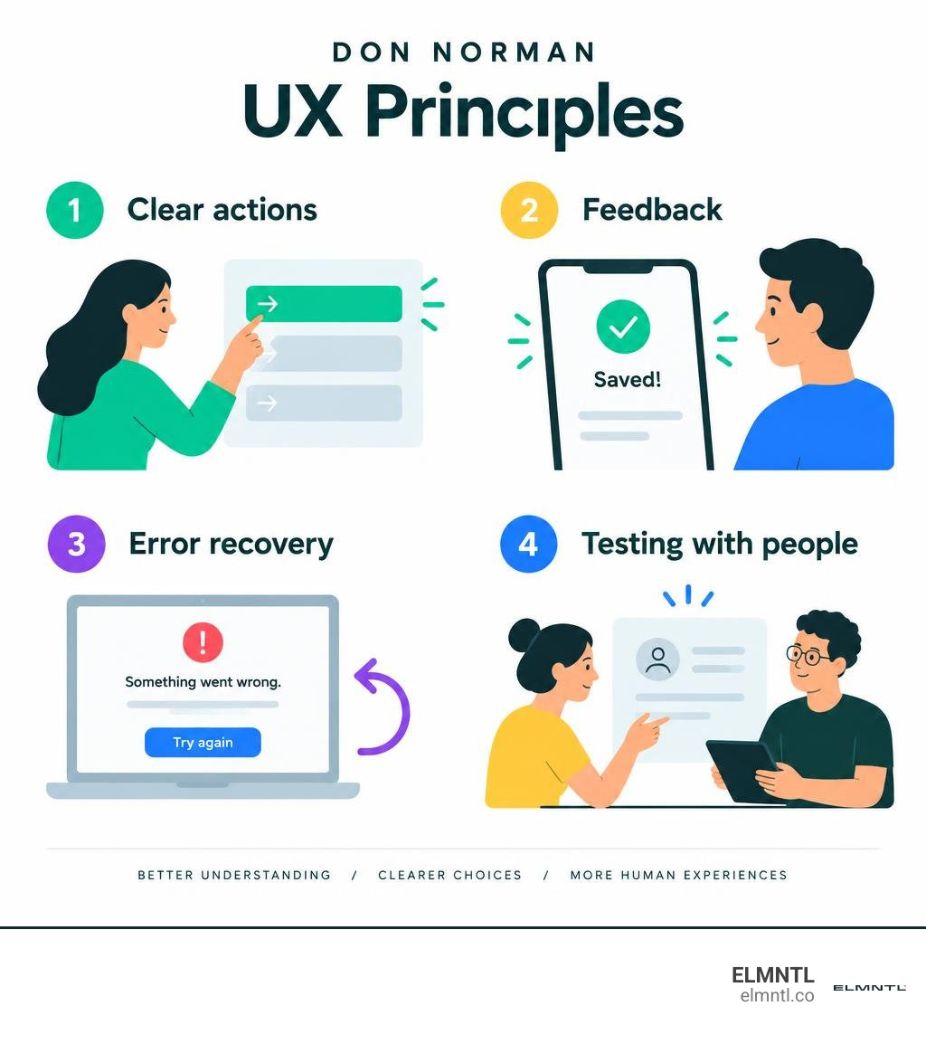
Don Norman’s UX principles help make products easier to understand and use. Show people what they can do, make the next step clear, give feedback after an action, and help them avoid or recover from mistakes. Test those choices with real people rather than assuming the design is obvious.
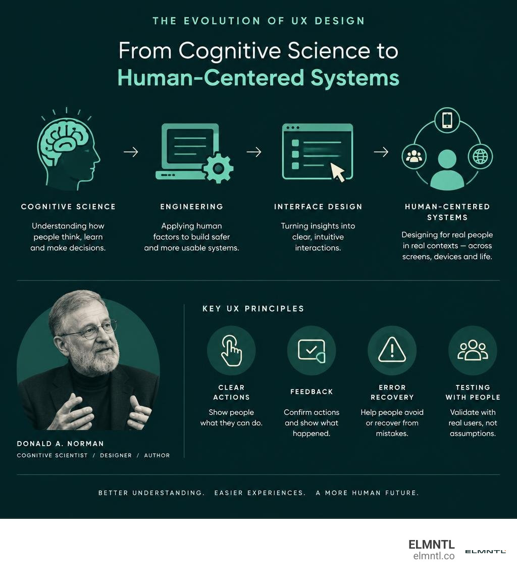
Norman brought ideas from cognitive science into the design of everyday objects and digital tools. His work also shows why good UX goes beyond a single screen: it considers the whole experience and, increasingly, the wider systems people live in.
Don norman ux word guide:
Introduction to Don Norman and Cognitive Design
To understand the core of modern digital interfaces, we have to look at the intersection of cognitive psychology, electrical engineering, and systems theory. Donald Arthur Norman, born on December 25, 1935, built a career spanning across academia and industry. Holding a degree in Electrical Engineering from MIT and a Ph.D. in Mathematical Psychology from the University of Pennsylvania, Norman approached digital design through the lens of human cognition rather than simple visual styling.
For 59 years since 1966, Norman has been associated with UC San Diego as a professor, Professor Emeritus, and the founding director of the Design Lab. His scholarly impact includes an h-index of 86, over 350 published works, and more than 60,000 academic citations. Rather than treating computers as purely technical calculators, Norman treated them as cognitive systems that must align with the natural wiring of human thought.
The Foundations and Origins of Don Norman UX
In the late 1970s and 1980s, computing was transitioning from mainframes operated by specialists to desktop machines meant for everyday office workers. During this shift, cognitive engineering emerged. Following the 1979 Three Mile Island nuclear accident, researchers investigated why plant operators misinterpreted control panel readings during a critical failure. Norman examined how physical controls, complex alarms, and poor system visibility contributed directly to human error.
His findings emphasized that human error is often the natural result of bad interface design. When users fail, it is usually because the system failed to communicate its internal state clearly. This realization led to his work on mental models and cognitive artifacts, which are external physical or digital representations that augment human memory and reasoning. Mastering these cognitive foundations is essential when building fundamental UX design basics that help users navigate software without confusion. As detailed in the biography of Don Norman, his interdisciplinary approach bridged the gap between theoretical science and practical product design.
Coining the Term: The Apple Era and Don Norman UX
In 1993, Norman joined Apple Computer as their User Experience Architect, marking the first time anyone held this phrase in an official job title. He later served as the Vice President of the Advanced Technology Group (ATG).
Norman noticed that the terms “usability” and “human interface” were too narrow. He realized that a person’s relationship with a computer did not begin when they turned on the monitor and end when they shut it down. Instead, the experience encompassed discovering the product in a catalog, purchasing it in a store, opening the physical packaging, reading the instructions, setting up the computer hardware, running applications, and seeking technical support. He established that every touchpoint forms a single continuous narrative.
Shifting from User-Centered Design to Human-Centered Design
Norman popularized the term “user-centered design” (UCD) in his 1986 collaborative book User Centered System Design: New Perspectives on Human-Computer Interaction. In its early stages, UCD focused on cognitive efficiency, task completion rates, and minimizing human error.
Over the years, Norman noticed that calling individuals “users” reduced people to functional task processors. He shifted his framework toward “human-centered design” (HCD), expanding the scope to include aesthetics, emotional satisfaction, physical ergonomics, and fun. He argued that attractive things work better because positive emotional states relax the brain, expand cognitive flexibility, and make people more tolerant of minor interface hurdles. More recently, this philosophy has expanded into “humanity-centered design,” which prioritizes planetary health, ethical implications, and circular economic systems.
| Design Framework | Primary Focus | Core Methodology | Typical Problem Scope |
|---|---|---|---|
| User-Centered Design (UCD) | Task completion, functional usability, and error reduction | Usability testing, task analysis, interface ergonomics | Individual digital screens and localized hardware workflows |
| Human-Centered Design (HCD) | Emotional satisfaction, aesthetic pleasure, and holistic journey | Empathy mapping, contextual observation, emotional design | End-to-end customer experiences and multi-device ecosystems |
| Humanity-Centered Design | Sustainability, systemic impact, and circular economy | Systems thinking, socio-technological design, community co-design | Global socio-environmental challenges, supply chains, and ethical AI |
Usability at Scale
In the late 1990s, Norman collaborated with fellow researchers to formalize evidence-based interaction research, scaling qualitative and quantitative usability testing into a repeatable standard for software teams worldwide.
By conducting rigorous empirical user research across thousands of websites and applications, usability researchers established standards for navigational structures, search behavior, information hierarchy, and mobile usability. Applying an industry standard UX design process ensures that product decisions are backed by measurable behavioral evidence rather than internal corporate assumptions.
Core Principles and the Seven Stages of Action Framework
Norman’s most celebrated work, The Design of Everyday Things (originally published in 1988 as The Psychology of Everyday Things and substantially revised in 2013), transformed design education. Holding over 8,100 Amazon reviews with an average 4.6-star rating, the book introduced everyday design failures to mainstream culture.
The most famous example from the book is the “Norman Door.” A Norman door is any door where the design confuses the user about whether to push, pull, slide, or turn it. If a door has a flat brass plate, it physically affords pushing. If it features a vertical bar, it physically affords pulling. When a door requires a printed sign reading “PUSH” on a pull handle, the design has failed. Norman used this example to demonstrate how good design should communicate instructions naturally without needing written labels. You can explore his essays directly on Don Norman’s JND.org, which takes its name from the psychological concept of the “just-noticeable difference.” Applying these psychological insights is vital for crafting an intuitive website user experience that removes cognitive friction for visitors.
The Fundamental Interaction Principles from Everyday Things
In his writing, Norman defined several foundational principles that govern physical and digital interfaces:
- Affordances: The actual, physical properties of an object that determine how it can possibly be used (a flat surface affords sitting or placing items; a touchscreen affords tapping).
- Signifiers: Any perceivable signal that tells people where and how an action should take place. In digital design, where pixels lack physical shape, signifiers like button outlines, underline styling, and icons show users where to click.
- Conceptual Models: An explanation, usually highly simplified, of how something works. When an interface matches the user’s mental model, interactions feel effortless.
- Visibility: The critical elements must be visible and discoverable. If an action is hidden behind ambiguous gestures, users will struggle to locate it.
- Feedback: Sending back information about what action has been completed. Feedback can be visual, auditory, or haptic, and it must occur immediately to confirm that the system registered the input.
- Constraints: Restricting the possible actions to prevent errors. Physical, logical, semantic, and cultural constraints guide users toward the correct choice without requiring memorization.
- Mapping: The relationship between a control and its effect on the system. When spatial mapping is intuitive, like a light switch panel matching the layout of the lights in a room, the user makes fewer mistakes.
Understanding these interaction foundations, along with the broader Principles of UX Design, allows teams to build cohesive systems that respect human memory limitations.
Bridging the Gulfs: The Seven Stages of Action
To explain how people interact with any system, Norman formulated the Seven Stages of Action model. Whenever someone uses a product, their thought process cycles through two major chasms: the Gulf of Execution (figuring out how to use the interface) and the Gulf of Evaluation (figuring out what happened to the system after taking an action).
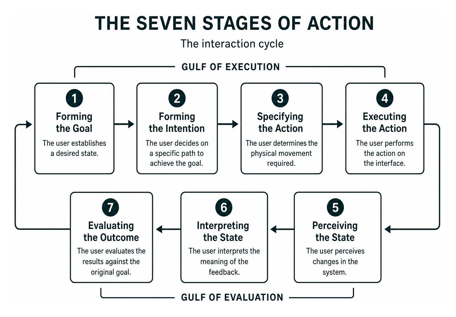
The seven distinct stages proceed through a continuous feedback loop:
- Forming the Goal: The user establishes a desired state (e.g., “I want to adjust the brightness in this room”).
- Forming the Intention: The user decides on a specific path to achieve the goal (e.g., “I will dim the ceiling light”).
- Specifying the Action: The user determines the physical movement required (e.g., “I will move the sliding switch downward”).
- Executing the Action: The user carries out the physical action (e.g., physically sliding the slider switch down).
- Perceiving the State of the World: The user senses the environmental or interface change (e.g., observing the room’s illumination level).
- Interpreting the Perception: The user evaluates the change (e.g., understanding that the light dimmed).
- Evaluating the Outcome: The user compares the result with their original goal (e.g., deciding whether the room is at the right brightness).
By mapping each step using comprehensive user journey mapping, designers can pinpoint where friction occurs. If a user cannot figure out which button to click, the system has a wide Gulf of Execution. If the screen freezes without showing a loading spinner, the system has a wide Gulf of Evaluation.
Applying Don Norman UX Principles to Modern Interfaces
In modern responsive design, Norman’s core principles apply directly to mobile applications, web platforms, and touch interfaces:
- Touch Targets and Signifiers: Touch screens offer no tactile buttons. Designers use visual signifiers, such as drop shadows, high-contrast borders, and rounded corners, to indicate that an element is interactive.
- Haptic and Visual Feedback: When a user completes a payment in a banking app, an immediate haptic vibration paired with a green checkmark animation confirms the transaction, closing the Gulf of Evaluation.
- Slips vs. Mistakes: Norman differentiated between slips (unconscious, accidental errors, like tapping the wrong button) and mistakes (conscious errors caused by a flawed mental model). Prevent slips by spacing interactive targets appropriately; prevent mistakes by providing clear explanations and confirmations before destructive actions.
- Progressive Disclosure: To reduce cognitive overload, show only the essential options at first, offering advanced settings on deeper screens.
Implementing these practices helps teams follow essential website UX best practices and keep visitors engaged.
From Everyday Things to DesignX: The Evolution of Humanity-Centered Design
Norman’s philosophy has expanded over the decades. In Emotional Design: Why We Love (or Hate) Everyday Things (2004), he examined the visceral, behavioral, and reflective levels of emotional processing. In Living with Complexity (2010), he demonstrated that complexity is necessary in rich systems; the goal of design is not to eliminate complexity, but to eliminate confusing complication. The close relationship between technical architecture and visual clarity forms the marriage of web design and UX, which makes complex systems approachable.
DesignX: Tackling Complex Socio-Technological Systems
As digital systems became embedded in infrastructure, healthcare, transportation, and finance, Norman recognized the limits of traditional craft design. Working with international design educators, he proposed DesignX, an evidence-based framework created to tackle complex socio-technological systems and wicked problems.
Wicked problems lack clear definitions, contain multiple competing stakeholders, have no single right answer, and evolve unpredictably when modified. DesignX moves design beyond intuition. It calls for combining human empathy with systems science, data analytics, and interdisciplinary collaboration across psychology, engineering, sociology, and business management.
Design for a Better World and the Don Norman Design Award
In his 2023 book, Design for a Better World: Meaningful, Sustainable, Humanity Centered, Norman dedicated roughly one-third of his analysis to sustainability, the circular economy, and regenerative design. He argued that designers must move past narrow consumer product cycles and help redesign industrial supply chains, reduce waste, and create ethical AI systems that support human values.
To support this mission, he established the Don Norman Design Award (DNDA) in 2023. The non-profit organization recognizes early-career practitioners, education programs, and cross-disciplinary organizations that build humanity-centered projects. Through an international summit and mentorship network, the initiative encourages designers to build systems that are socially equitable, environmentally regenerative, and ethically sound.
Frequently Asked Questions About Don Norman UX Design
Why did Don Norman coin the term User Experience?
Norman created the title “User Experience Architect” while working at Apple in 1993 because existing terms like “human factors” and “user interface” were too narrow. He wanted a concept that encompassed the customer’s complete journey, including industrial design, retail environments, software performance, physical packaging, and customer service.
What is the difference between an affordance and a signifier?
An affordance is a real relationship between a physical object and an organism that determines how it can be used (for example, a chair affords sitting). A signifier is an indicator that communicates where and how an action should take place (for example, the word “Search” inside an input box, or an icon showing a shopping cart). In digital design, almost all visual interactive cues are signifiers.
How do the Gulf of Execution and Gulf of Evaluation affect digital products?
The Gulf of Execution measures the gap between what a user wants to achieve and how easy it is to perform that action using the system’s controls. The Gulf of Evaluation measures how easily the user can see and interpret the new system state to confirm that their goal was accomplished. High interaction friction in either gulf leads to user frustration and site abandonment.
Conclusion: Shaping the Future of Meaningful Digital Experiences
From foundational cognitive science to systems-level humanity-centered design, Don Norman’s work highlights that technology must always serve people, not the other way around. Clear signifiers, immediate feedback loops, error-tolerant systems, and systems-level thinking are timeless principles for building software that feels natural.
At ELMNTL, we integrate these behavioral principles into every digital interface, website build, and brand campaign we launch. If you want to refine your digital interfaces, discover our comprehensive digital marketing and design services and build online experiences that resonate with your audience.