

What Is a User Interface?
A user interface (UI) is the part of a product you use to make things happen. On a website, that includes buttons, menus, forms, and the messages that tell you what happened after you click. UI is one part of user experience (UX), which covers the whole journey, from finding what you need to finishing a task.
For a business, a clear UI helps visitors understand what to do next. This guide explains the main types of interfaces, what makes them work, and how to design them around real users.
What Is a User Interface and How Does It Work?
At its core, a user interface represents the bridge between human intention and machine execution. Whenever you tap a glass screen, click a submit button, or speak a voice command, you are interacting with a structured layer designed to translate your goals into software instructions. An academic overview of user interface systems demonstrates that UI encompasses both the physical input hardware and the visual or sensory software feedback that lets you know your action succeeded.
In human-computer interaction research, researchers often distinguish between “thin” and “thick” definitions of an interface:
- Thin definitions focus purely on the surface layer. This includes the visual elements, physical buttons, typography, colors, and direct touch targets on a screen.
- Thick definitions look deeper at the entire cognitive exchange. They consider user perception, mental models, decision-making speed, and the computational processes happening behind the scenes to deliver feedback.
Understanding both perspectives helps us build digital products that feel effortless. When an interface aligns with how people naturally think, users spend less time deciphering controls and more time completing their tasks. In fact, research shows that a well-designed user interface can increase website conversion rates by up to 200%. Exploring the complete guide to UI/UX basics gives teams a clear framework for building intuitive digital touchpoints.
The Core Elements of a User Interface
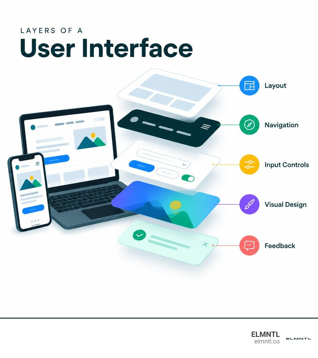
Every digital interface relies on a standardized library of building blocks. These components work together to provide clarity, visual structure, and operational feedback:
- Input Controls: These elements allow users to manipulate data, select choices, or trigger system actions. Common examples include text input fields, radio buttons, checkboxes, dropdown menus, and primary call-to-action buttons.
- Navigational Components: These guide people through an application or website hierarchy. Key tools include header menus, breadcrumbs, search bars, pagination tabs, and mobile drawer navigators. Mastering UX design navigation prevents users from getting lost in multi-layered digital environments.
- Informational Elements: These provide context, status updates, and feedback during or after an action. They include modal windows, tooltips, progress bars, interactive badges, and error alert banners.
- Container Layouts: Structural mechanisms like sidebars, accordion panels, cards, and grid rows group related content together, keeping complex interfaces clean and scannable.
Together, these elements rely on consistent typography, purposeful color palettes, and subtle micro-interactions to establish a clear visual hierarchy.
UI vs. UX: Understanding the Essential Differences
While people often use “UI” and “UX” interchangeably, they represent two distinct parts of the product design process. UI is about form, visual styling, and specific interactive mechanics. UX is about substance, architecture, user journeys, and emotional satisfaction.
Think of building a house: UX design creates the architectural floor plan, structural traffic flow, and room placements. UI design provides the finished finishes, lighting fixtures, paint choices, window styles, and doorknobs that bring the space to life. Diving into a comprehensive guide to UX design basics helps clarify how these disciplines support each other.
| Dimension | User Interface (UI) | User Experience (UX) |
|---|---|---|
| Primary Focus | Visual design, interactive elements, typography, and aesthetics | User journey, problem solving, information architecture, and utility |
| Key Deliverables | High-fidelity mockups, UI component libraries, style guides, UI kits | Wireframes, user journey maps, personas, user flow diagrams |
| Core Metrics | Visual engagement, click-through rates, brand consistency, visual accessibility | Task completion rate, time-on-task, bounce rate, customer satisfaction |
| Common Tools | Figma, Adobe XD, design tokens, frontend component frameworks | Research interviews, heatmaps, analytics dashboards, testing suites |
The Evolution and History of Digital Interfaces
Modern digital interfaces are the result of decades of hardware and software innovation. Early computing required operators to interact directly with hardware using physical patch cords, toggle switches, and punched paper cards.
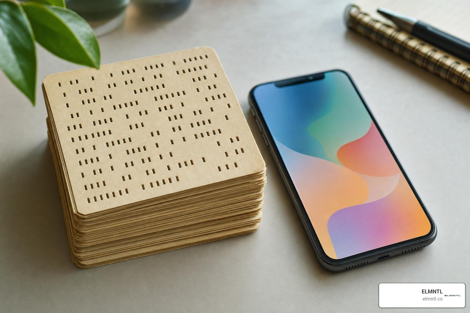
In 1968, Dr. Douglas Engelbart delivered what is now celebrated as the “Mother of All Demos.” He demonstrated the computer mouse, hypertext links, multiple on-screen windows, and real-time screen collaboration. A few years later, in 1973, researchers at Xerox PARC developed the Xerox Alto, pioneering bitmapped displays, desktop metaphors, and graphical folders. By 1984, the Apple Macintosh brought the graphical user interface into the mainstream, proving that computing could be visual, friendly, and accessible to non-technical users.
From Batch Processing and CLI to the Modern Graphical User Interface
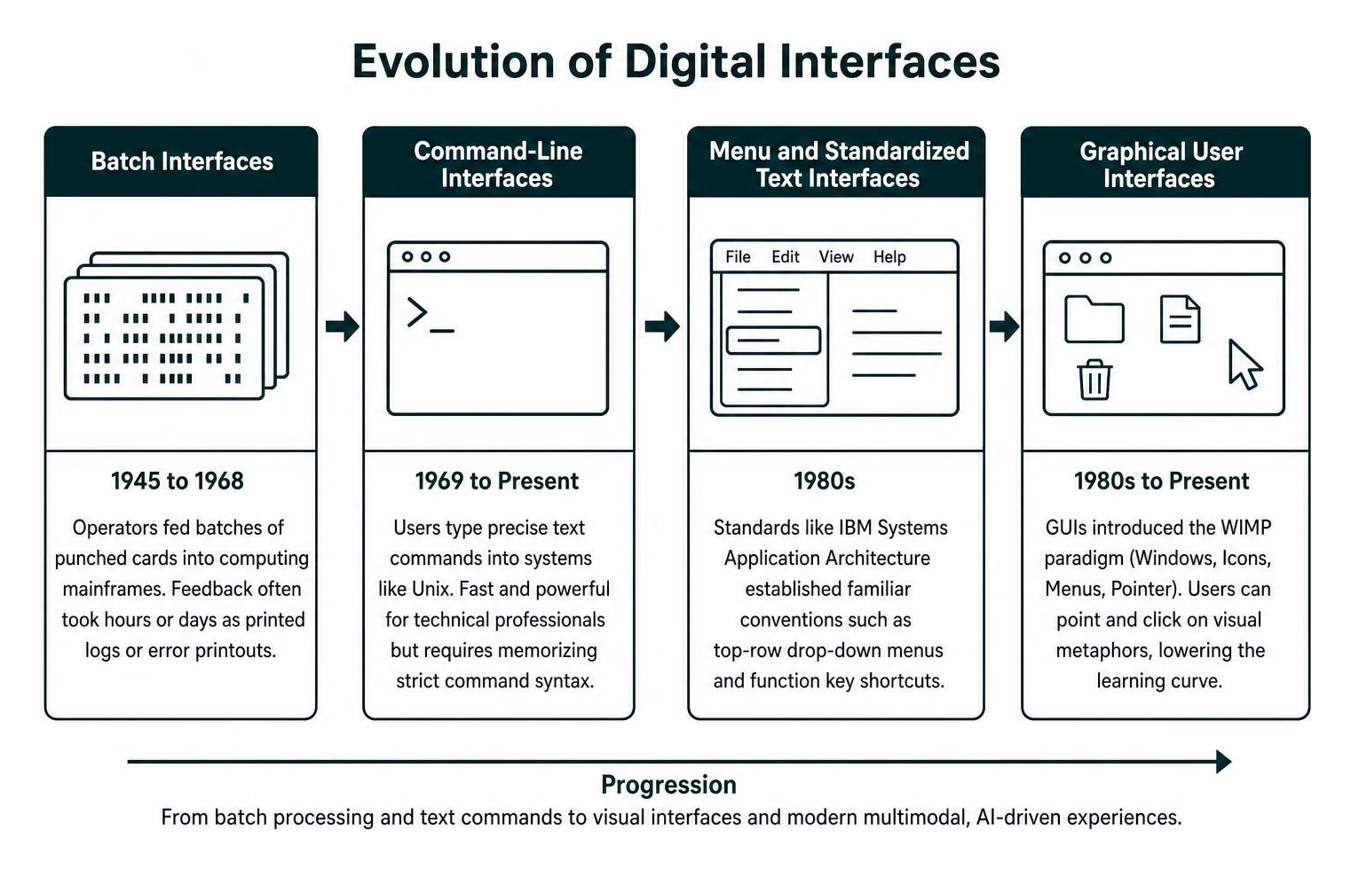
The progression of interface technology unfolded across several major eras:
- Batch Interfaces (1945 to 1968): Operators fed batches of punched cards into computing mainframes. Feedback often took hours or days, arriving as printed reams of paper logs or fatal error printouts.
- Command-Line Interfaces (1969 to Present): Teletype machines and video display terminals allowed developers to type precise text commands into systems like Unix. While fast and powerful for technical professionals, CLIs required memorizing strict command syntax.
- Menu and Standardized Text Interfaces (1980s): Standards such as IBM Systems Application Architecture established familiar conventions, like top-row drop-down menus and function key shortcuts.
- Graphical User Interfaces (1980s to Present): GUIs introduced the WIMP paradigm (Windows, Icons, Menus, Pointer). Users could point and click on realistic visual metaphors, dramatically lowering the learning curve for personal computing.
Multimodal, Spatial, and AI-Driven Interfaces
As we navigate November 2026, interfaces have expanded far beyond desktop monitors and laptop trackpads. Modern interaction design relies on multimodal experiences that seamlessly combine touchscreens, voice recognition, spatial eye-tracking, and artificial intelligence.
Generative UI systems can now create layouts on the fly, tailoring screen density, language, and interactive controls to an individual user’s real-time needs and accessibility preferences. Rather than forcing people to learn machine rules, modern interfaces adapt dynamically to human communication.
Major Types of Digital and Physical Interfaces
Digital interfaces take many shapes depending on the device, user context, and task complexity. A technical explanation of UI classifications highlights several major categories used across consumer and enterprise environments.
Graphical, Voice, and Touch-Based Systems
Each type of interface serves specific user needs:
- Graphical User Interfaces (GUIs): The visual foundation of everyday computing, relying on icons, windows, forms, and visual pointers across web browsers and desktop operating systems.
- Touch Interfaces: Designed specifically for finger taps, pinch-to-zoom gestures, and edge swipes on smartphones, tablets, and kiosks. Studying award-winning mobile app UI design reveals how touch targets and thumb-reach zones directly influence user retention.
- Voice User Interfaces (VUIs): Systems like smart assistants, automotive voice controls, and interactive voice response phone systems allow people to complete tasks completely hands-free using natural speech.
- Natural Language and Conversational UIs: Modern conversational systems let users ask questions and execute complex workflows without navigating through nested menu trees.
- Spatial and Gesture Interfaces: Augmented and virtual reality headsets track hand gestures and eye gaze to manipulate three-dimensional objects in real or virtual space.
User Interface vs. Human-Machine Interface (HMI)
While UI and HMI share core design principles, they serve different environments. A standard user interface handles interactions on consumer and business computing devices, like mobile apps, SaaS platforms, and enterprise intranets.
A Human-Machine Interface (HMI) refers specifically to operator control consoles used for physical, mechanical, or industrial equipment. HMIs appear in high-speed train cabs, factory automation floors, power generation plants, and medical monitoring rooms. Because HMI failures can cause physical damage or safety risks, their designs prioritize physical emergency buttons, rugged knobs, extreme visual contrast, and high-reliability status readouts over consumer visual styling.
Core Principles and Best Practices for High-Impact UI Design
High-performing digital products follow proven psychological rules and design heuristics. A foundational guideline is the Principle of Least Astonishment (POLA), which states that a system should behave in a way that minimizes surprises for users. Interfaces should respect established web conventions, placing elements where visitors instinctively expect to find them.

Designers often rely on fundamental UI design principles and best practices alongside Peter Morville’s classic UX Honeycomb framework. To succeed, an interface must be:
- Usable: Simple, direct, and easy to operate without reading a manual.
- Useful: Built to help users solve real problems and achieve their goals.
- Desirable: Visually clean, engaging, and aligned with modern aesthetic expectations.
- Findable: Organized so navigation, search tools, and critical buttons are effortless to locate.
- Accessible: Structured so individuals of all abilities, including those using assistive technology, can navigate smoothly.
- Credible: Designed with professional typography, clear messaging, and secure indicators that build trust.
- Valuable: Focused on delivering measurable ROI for the business and meaningful utility for the customer.
Interfaces should also be built for forgiveness. Providing clear undo actions, confirmation dialogues before destructive tasks, and constructive error messages keeps users feeling confident and in control.
Usability Heuristics and Visual Hierarchy
Visual hierarchy directs the user’s eye to the most important elements on the screen first. Designers establish this order using visual weight, scale, contrasting colors, and intentional whitespace.
When marketing teams run website UI and UX conversion audits, fixing broken visual hierarchy is often the fastest way to lift engagement. Grouping related items, simplifying clutter, and making primary action buttons visually distinct can lead to conversion rate increases of up to 200%.
Accessible, Responsive, and Performance-Driven Design
An effective interface must work smoothly across different devices, screen sizes, and user capabilities:
- Accessibility Standards: Following Web Content Accessibility Guidelines (WCAG) ensures high color contrast ratios, clear text scaling, keyboard navigability, and proper semantic labels for screen readers.
- Responsive Layouts: Flexible grids and adaptive containers adjust automatically across desktop displays, tablets, and smartphones.
- Performance Optimization: Fast-loading elements and efficient animations keep the interface responsive. Sluggish feedback creates cognitive friction and drives visitors away.
Frequently Asked Questions About User Interfaces
What is the primary difference between UI and UX?
UI concentrates on visual touchpoints, typography, buttons, color schemes, and interactive components. UX encompasses the overall user journey, information architecture, ease of use, and emotional satisfaction when interacting with a digital product.
How does a well-designed UI boost conversion rates?
An intuitive interface removes friction, clarifies value propositions, guides attention toward key calls to action, and establishes credibility. Research shows that refining UI clarity can increase site conversion rates by up to 200%.
What is the difference between a UI and an HMI?
UI generally describes consumer and digital software interfaces, such as websites and mobile apps. An HMI (Human-Machine Interface) refers to control panels and operator interfaces used to run physical industrial machinery, manufacturing lines, and vehicles.
Conclusion
A well-crafted user interface does more than make an application look appealing. It reduces cognitive load, clarifies user journeys, builds brand authority, and directly drives business conversions. As digital environments incorporate new AI capabilities and spatial tools, maintaining clean, accessible, and intuitive design standards remains vital for long-term product success.
To create impactful digital experiences, modern teams rely on integrated research, agile design sprints, and robust prototyping workflows. Reviewing the top UI and UX software tools is an excellent way to see how modern creators build and test pixel-perfect interfaces before releasing them to the world.