
Make CSS User Interface Properties Work for Your Visitors
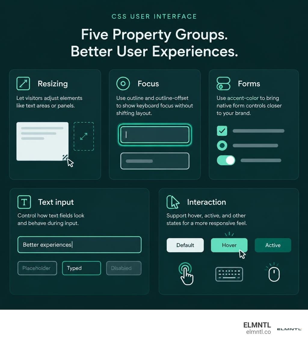
CSS user interface properties control how people interact with a page. Use resize to let visitors adjust a text area or panel, outline and outline-offset to show keyboard focus without shifting layout, and accent-color to bring native form controls closer to your brand. Start with the interaction you want to improve, then test it with a mouse, keyboard, and touch screen.
Small choices can make a site easier to use, or harder. This guide explains what each property does, where it helps, and which newer options need browser testing.
Core Fundamentals of the CSS User Interface Specification
Building digital products that feel intuitive requires more than just clean layouts and eye-catching typography. At its foundation, the official specification for CSS Basic User Interface Module Level 3 defines how browsers handle real-world user interactions. While basic styling alters visual presentation like backgrounds and fonts, UI properties govern how components respond to physical input devices such as mice, keyboards, touchscreens, and assistive technology.
Modern styling specifications split visual aesthetics from interactive mechanics. When an element changes state, whether through user hover, focus, or drag, the browser rendering pipeline must calculate geometry, repaint pixels, and resolve hit-testing. Understanding how these features interact with the Document Object Model allows us to build responsive interfaces that prevent costly layout shifts, preserve accessibility standards, and respect native operating system conventions.
Box-Model Separation: Outlines Versus Borders
One of the most fundamental concepts in interface styling is understanding how outlines differ from borders. While both draw lines around elements, their behavior in the browser rendering pipeline is completely different. A border is an integral part of the standard CSS box model. Adding a border increases the total computed width and height of an element, which can trigger layout reflow and shift neighboring elements.
Outlines, by contrast, act like visual overlays. They are painted outside the element border-box without occupying any physical space in the document flow. You can learn more about balancing functional layout with visual clarity in our guide to UI/UX basics.
| Property Feature | CSS Outlines | CSS Borders |
|---|---|---|
| Box Model Impact | Occupies zero space; does not affect computed dimensions | Contributes directly to the total box size |
| Layout Reflow | Never causes reflow or layout recalculation | Can cause neighboring elements to shift on state change |
| Edge Customization | Applied uniformly around the entire perimeter | Can style individual edges independently (border-top, etc.) |
| Spacing Control | Supports outward or inward push via outline-offset |
Bound directly between padding and margin edges |
| Primary Use Case | Visual focus rings, keyboard indicators, active highlights | Structural framing, card containers, and visual boundaries |
Because outlines do not cause layout reflow, they are the ideal tool for keyboard focus indicators. When a user navigates via keyboard, popping a border into existence can cause jarring micro-shifts across the page. Outlines provide crisp visual cues without disturbing layout stability.
Enhancing Focus Rings with Outline Offset
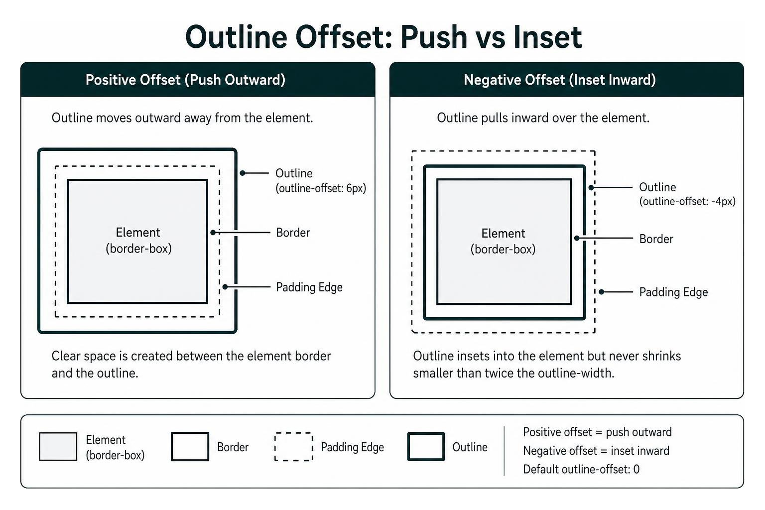
The outline-offset property enhances standard outlines by creating clear space between an element’s border and its outline. The shorthand outline property sets outline-width, outline-style, and outline-color simultaneously, but it does not include outline-offset.
The outline-offset property accepts standard length values such as pixels or rem units, starting with a default value of 0. When you pass a positive length, the outline moves outward away from the element boundary. When you pass a negative length, the outline pulls inward over the element content. However, the specification dictates that negative values must not cause the outline to shrink smaller than twice the computed value of outline-width.
Separating the outline from the element edge improves readability. It ensures focus indicators remain distinct against complex backgrounds or dark-themed buttons, making it much easier to meet accessibility contrast guidelines without adding extra container elements.
Interactive Controls: Resizing, Cursors, and Hit-Testing
Dynamic web applications often require layout areas that users can adjust directly, such as sidebars, split panes, and preview windows. Pairing proper sizing controls with responsive cursor indicators ensures your users instantly understand which elements are interactive. Using modern techniques alongside top UI development tools helps streamline these complex interaction states.
Controlling Element Dimensions with the Resize Property
The CSS resize property allows users to control element dimensions directly by dragging a resize handle rendered in the corner of the box. By default, browsers apply this behavior to multi-line text input fields, but you can apply it to standard containers as well.
The resize property accepts one of six standard values:
none: The element offers no user-adjustable sizing mechanism.both: The user can adjust both horizontal width and vertical height.horizontal: The user can only adjust the width along the inline axis.vertical: The user can only adjust the height along the block axis.block: Sizing is constrained to the block dimension according to writing mode.inline: Sizing is constrained to the inline dimension according to writing mode.
A common issue occurs when developers apply resize: both; to a standard division and nothing happens. The resize property only applies to elements that are scroll containers, as well as replaced elements like images, videos, and iframes. To enable user resizing on a standard container, you must set the overflow property to auto, scroll, or hidden. Always pair user-resizable containers with min-width, max-width, min-height, and max-height to prevent users from breaking the layout.
Defining Custom Cursor Hotspots and States in CSS User Interface Design
The cursor property defines the mouse pointer displayed when a visitor hovers over an element. The specification supports over 30 predefined cursor keywords, including auto, default, pointer, text, wait, grab, grabbing, zoom-in, and not-allowed.
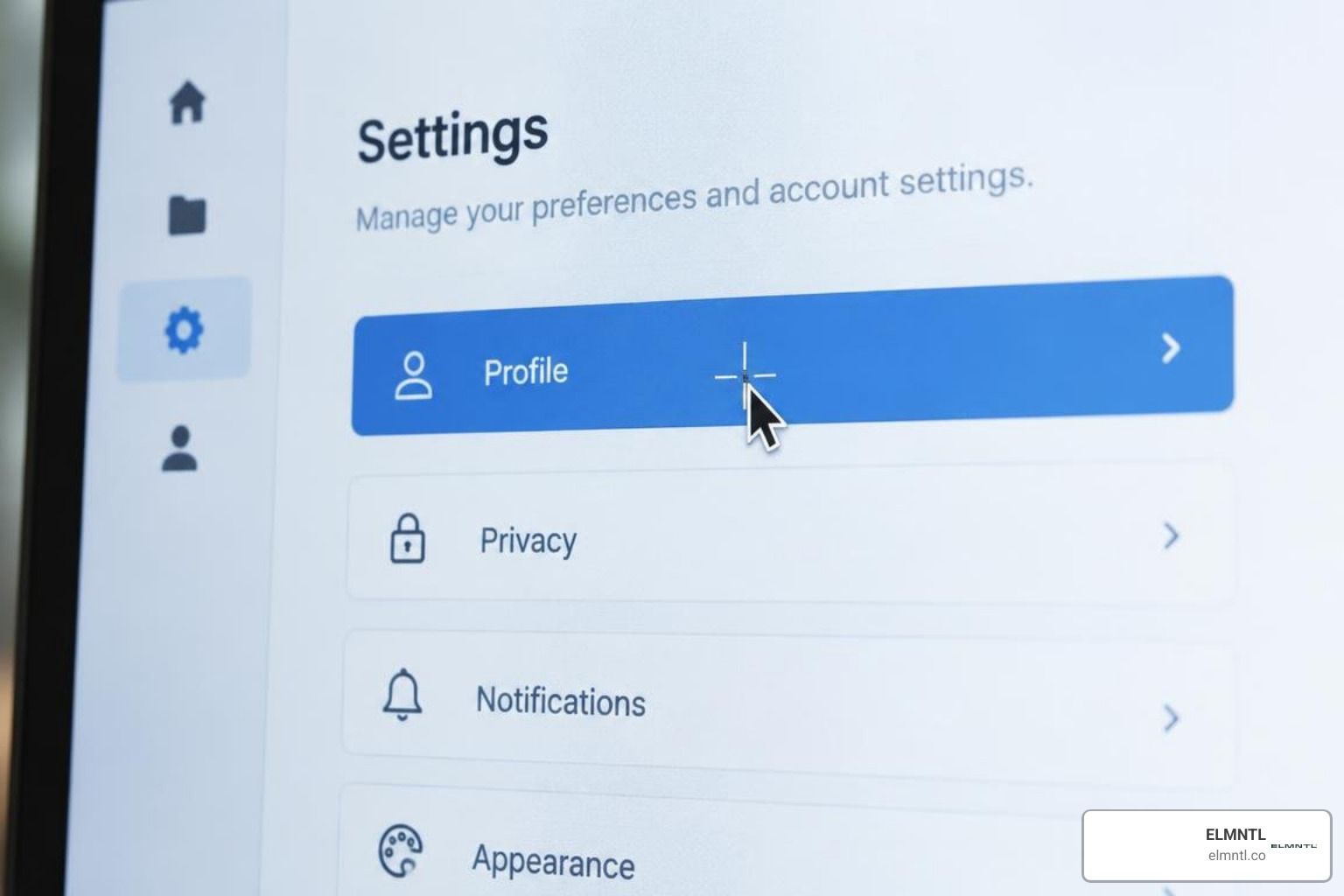
Beyond keywords, you can define custom image cursors using URLs pointing to SVG or PNG assets. When using custom cursor graphics, you must specify horizontal and vertical hotspot coordinates to define the exact active pixel of the pointer.
For example, when using a custom graphic, you might declare cursor: url('custom-pointer.svg') 4 12, pointer;. In this declaration, the numbers 4 and 12 represent the x-coordinate and y-coordinate of the hotspot from the top-left corner of the image file. Always include a fallback keyword like pointer or default at the end of the declaration list so the browser can maintain usability if the image asset fails to load.
Managing User Interaction with Pointer Events and User Select
Controlling how the browser handles user interaction prevents accidental clicks and improves usability. Two essential properties in this domain are pointer-events and user-select. You can explore more frontend refinement principles in our guide to not building ugly websites.
The pointer-events property determines whether an element can become the target of mouse or touch events during browser hit-testing. It primary supports two core values:
auto: The element receives clicks, hovers, drags, and touch events normally.none: The element is completely ignored during hit-testing. Clicks pass directly through to whatever element sits underneath.
The pointer-events: none; declaration is useful for decorative floating icons, loading overlays, or custom dropdown arrows positioned inside input fields.
The user-select property controls whether visitors can highlight and copy text. It accepts five values:
auto: Computes based on browser defaults and parent element rules.text: The text can be selected and copied normally by the user.none: Text selection is blocked, preventing accidental highlights on buttons and menus.contain: Selection starts within the element but cannot expand into neighboring nodes.all: A single click selects the entire contents of the element at once, which is helpful for code blocks and API key displays.
Styling Native Form Widgets and Text Input Carets
Historically, styling native form controls required complex CSS resets and custom markup workarounds. Modern browser engines and the MDN Web Docs basic user interface guidelines now provide streamlined properties to customize native components with minimal code.
Customizing Input Widgets with Accent Color and Appearance
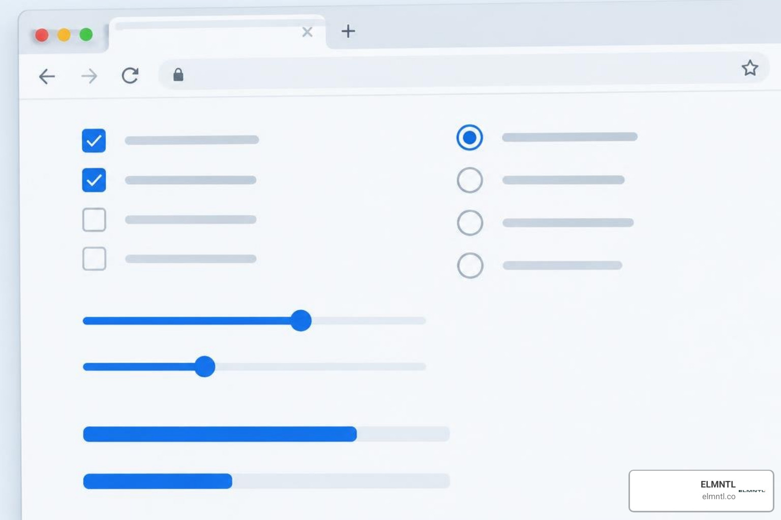
The accent-color property allows authors to specify a custom accent color for native UI widgets. Instead of replacing checkmarks and radio buttons with custom SVG graphics, applying accent-color: #0066ff; instantly colors checkboxes, radio inputs, range sliders, and progress bars. The browser automatically calculates high-contrast foreground checkmarks and track fills, maintaining platform accessibility.
The appearance property controls whether an element renders using platform-native widget styling or standard box-model CSS styling. Its primary values include:
auto: Renders the default platform-native appearance for that element type.none: Strips away native operating system rendering, converting elements likedropdowns and buttons into clean slates for custom CSS styling.baseandbase-select: Standardized modern keywords that remove native styling while preserving semantic keyboard controls and popover behaviors.
Advanced Text Insertion Styling via CSS User Interface Caret Properties
Customizing the text insertion point gives web applications a refined feel. Modern specifications define three properties for managing this visual indicator:
caret-color: Sets the color of the text cursor inside editable fields like,