
Android App UI Design: From Wireframe to Production
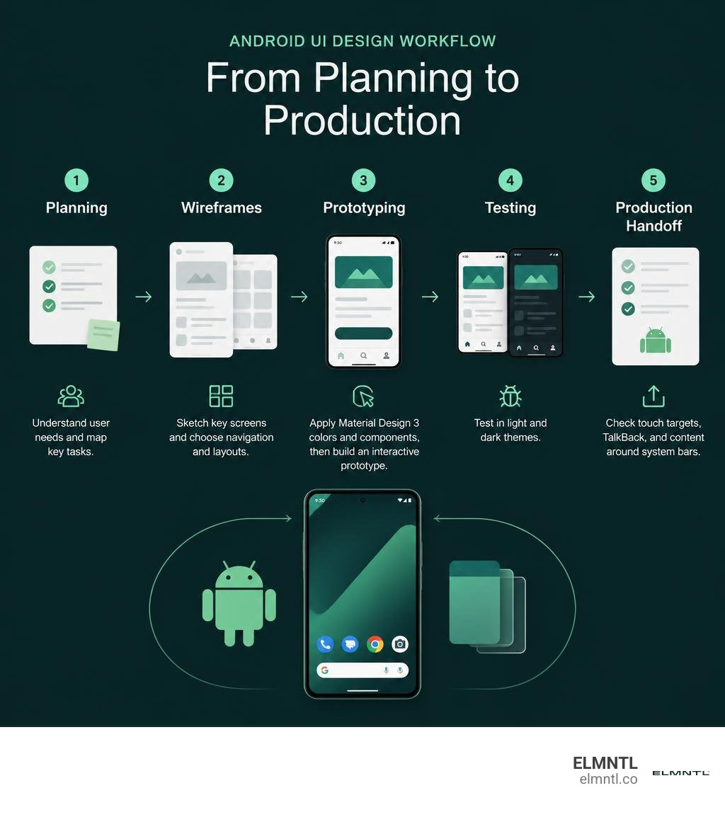
When planning an android app ui design, start by mapping what people need to do. Sketch the key screens, then choose navigation and layouts that fit phones and larger windows. Apply Material Design 3 colors and components, build an interactive prototype, and test it in light and dark themes. Before handoff, check touch targets, TalkBack, and how content fits around system bars.
The goal is a design that looks good and works well when someone uses it. This guide walks through the decisions that take an app from its first wireframe to production.
Helpful resources to explore:
- Examples of the best mobile app ui design
- A review of the best ui development tools
- A guide to comparing every major ui design tool
Core Principles of Android App UI Design with Material Design 3
Android powers over 3 billion active devices globally, spanning compact smartphones, dual-screen foldables, tablets, and desktop workstations. Designing interfaces across this ecosystem requires a disciplined design system. Google built Material Design 3 (M3) to establish visual consistency, emotional depth, and responsive ergonomics across the entire Android ecosystem.
Mastering modern Android UI requires a solid grasp of core product design fundamentals. Revisiting a comprehensive guide to UI UX basics helps ground your architectural choices before diving into platform-specific tokens. M3 shifts away from rigid drop shadows and uniform grey elevations, introducing dynamic color theming, expressive typography tokens, and fluid component shaping. Following the official Android design guidelines, modern Android interfaces rely on tonal surfaces, context-aware color mapping, and adaptive layouts rather than static pixel values.
Dynamic Color Roles and Theme Seeds
Introduced in Android 12 and refined in recent releases, dynamic color extraction analyzes the user’s personal device wallpaper to generate a custom tonal palette. This algorithm extracts seed colors, generating five tonal palettes spanning primary, secondary, tertiary, neutral, and neutral-variant tones.
To use dynamic color effectively, designers map elements to specific semantic color roles:
- Primary and On-Primary: Primary represents the dominant brand or action color, used for high-emphasis buttons and active states. On-Primary is the precise contrast color applied to icons and text placed on top of the primary container.
- Secondary and Secondary Container: These roles handle medium-emphasis elements, such as filter chips, toggle selections, and navigation highlights.
- Tertiary and Tertiary Container: Tertiary provides balanced, complementary accents that bring visual variety to progress indicators, tags, or highlighted alerts without clashing with the primary tone.
- Surface and Surface Containers: Instead of artificial elevation drop shadows, M3 uses distinct surface container levels (Lowest, Low, Container, High, Highest) with subtle tonal shifts to indicate depth.
When crafting assets in tools like Figma, using the community-verified Android UI Kit on Figma ensures your token names directly mirror the dynamic color tokens used in Jetpack Compose codebases.
Expressive Motion and Morphing Shapes
Modern Material Design embraces expressive shapes and purposeful motion tokens. Material Design 3 provides 35 distinct shape options, ranging from subtle rounded corners to asymmetrical cutouts and pill containers.
Motion is not purely aesthetic; it communicates screen hierarchy and continuity. With modern shape-shifting components, a floating action button can morph into a full-bleed surface sheet as the user interacts with it. Motion tokens define duration and easing curves within Jetpack Compose, ensuring that shared element transitions feel responsive, snappy, and natural as users navigate across activities.
Phase 1: Planning Architecture and Selecting Navigation Patterns
A strong architecture sets up a seamless user journey. Navigating an app should feel second nature, keeping essential actions within comfortable reach. Following proven UX design process steps during the discovery and wireframing phases ensures that screen flows, task sequences, and navigation hierarchies align with real user behaviors.
Choosing Between Navigation Bars, Rails, and Drawers
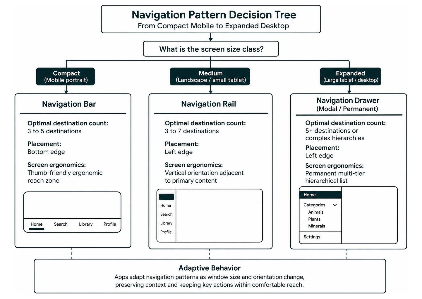
Android interfaces utilize three primary navigation components depending on screen size, device orientation, and destination counts.
| Navigation Component | Optimal Destination Count | Target Window Size Class | Screen Ergonomics & Placement |
|---|---|---|---|
| Navigation Bar | 3 to 5 destinations | Compact (Mobile portrait) | Bottom edge, thumb-friendly ergonomic reach zone |
| Navigation Rail | 3 to 7 destinations | Medium (Unfolded foldables, small tablets, landscape) | Left edge, vertical orientation adjacent to primary content |
| Modal / Permanent Navigation Drawer | 5+ destinations or complex hierarchies | Expanded (Large tablets, desktop windowing) | Left edge, permanent multi-tier hierarchical list |
For compact handheld devices, placing 3 to 5 destinations inside a bottom Navigation Bar keeps touch targets inside the natural thumb zone. When users pivot to larger viewports or horizontal orientations, apps should swap the bottom bar for a vertical Navigation Rail. For deeply structured data, adaptive list-detail layout patterns allow users to browse high-level categories while viewing expanded detail panes side by side.
Supporting Predictive Back Gestures
Starting with Android 13, the predictive back gesture lets users preview their destination screen or home launcher before completing a swipe. This feature prevents accidental exits and lost form inputs.
Designers must ensure their UI does not place custom horizontal swipe carousels or interactive sliders along the extreme left and right screen boundaries. System edge swipes trigger back navigation, so maintaining sufficient edge padding prevents gesture conflicts and ensures smooth predictive back animations.
Phase 2: Wireframing and Structuring Adaptive Layouts
With over 3 million apps available on Google Play, building responsive interfaces is essential for standing out. Designers should assemble their layouts using top UI and UX software that supports adaptive constraint parameters.
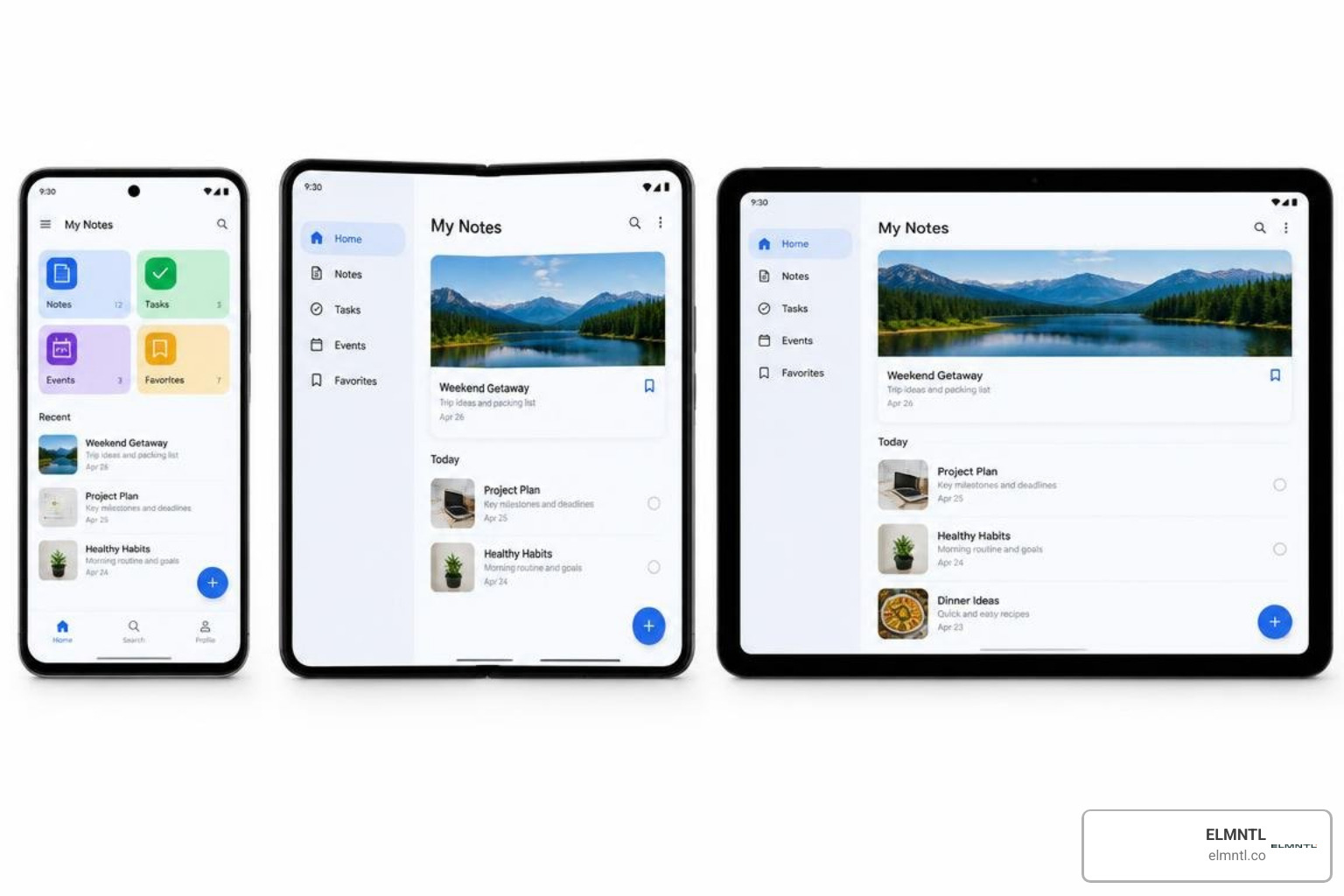
Android evaluates screen real estate using Window Size Classes rather than fixed device resolutions:
- Compact Width (< 600dp): Standard mobile phones in portrait mode.
- Medium Width (600dp to 839dp): Large unfolded foldables, tablets in portrait orientation, and multi-window split screens.
- Expanded Width (840dp+): Full tablets in landscape, dual-screen setups, and desktop windowing environments.
Setting Up Layouts for Android App UI Design
Layouts follow an 8dp baseline grid system, with 4dp micro-increments reserved for tight typography alignments and icon spacing.
Android 15 enforces mandatory edge-to-edge rendering, requiring apps to draw content continuously behind the transparent status bar and bottom gesture bar. Designers must account for window insets, applying safe padding so that top app bars and bottom interaction triggers are never obscured by system hardware cutouts, camera notches, or navigation pills. You can review real-world component structures inside Android UI elements and components to see how industry-leading applications handle edge-to-edge layouts gracefully.
Building Canonical Two-Pane and List-Detail Screens
When structuring interfaces for foldable devices and tablets, avoid simply stretching a single-column smartphone layout. Instead, adopt canonical two-pane layouts:
- List-Detail: Keeps a master item feed on the left pane while rendering selected item details on the right pane.
- Supporting Pane: Allocates a primary focal work area on one side, flanked by secondary metadata or contextual actions on the other.
- Feed-Detail: Displays a continuous feed that expands into detailed readouts when an item is selected.
These multi-pane scaffolds automatically stack into sequential single-screen paths on compact screens, expanding into side-by-side configurations whenever more screen real estate becomes available.
Phase 3: High-Fidelity Prototyping with Core Material Components
During high-fidelity prototyping, wireframes transform into interactive, polished interfaces. Studying award-winning mobile app UI design examples helps reveal how top digital products balance visual personality with strict platform guidelines.
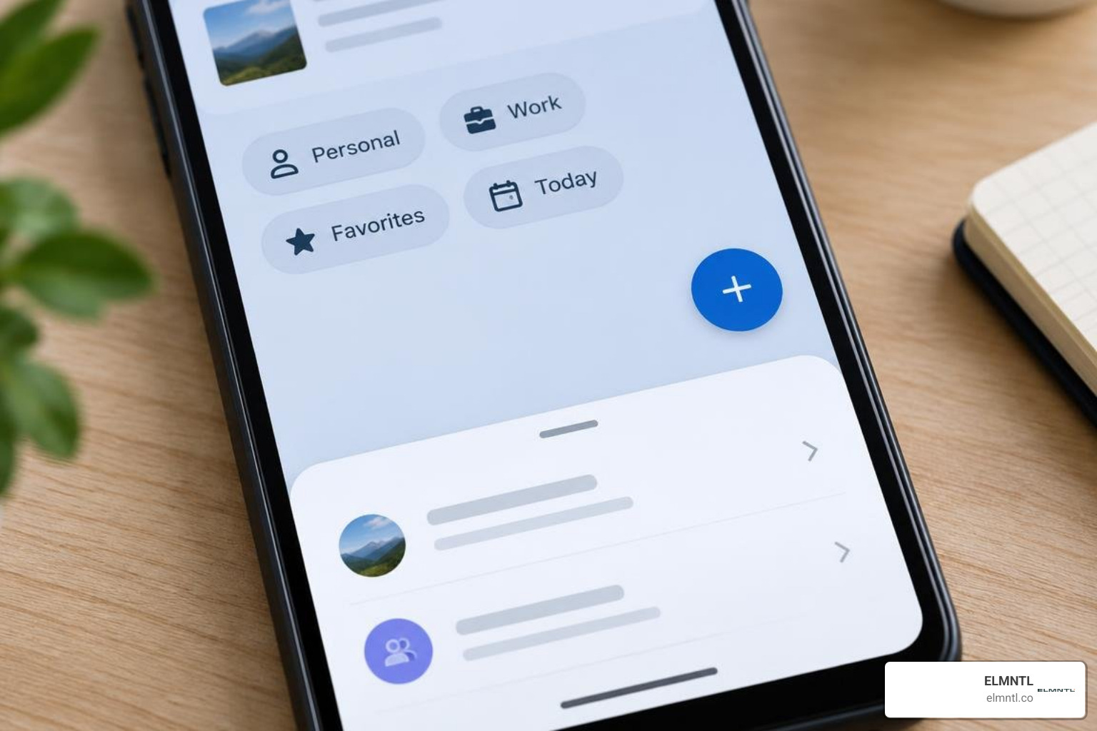
Interactive Component Rules: FAB, Bottom Sheets, Dialogs, and Chips
Material Design 3 establishes clear rules for its core interactive components:
- Floating Action Button (FAB): Represents the single most important primary action on a screen, such as composing an email or creating a document. Place the FAB at the bottom-end corner above the navigation bar. Use an Extended FAB (icon plus text label) on main landing dashboards, collapsing it to a standard round-corner icon on scroll.
- Bottom Sheets: Ideal for contextual actions and supplemental options. Standard bottom sheets sit alongside the main screen content, while Modal Bottom Sheets overlay the background with a dimmed scrim to focus user attention on secondary tasks.
- Dialogs: Reserved exclusively for critical, urgent alerts requiring an explicit user decision. Dialogs should always contain clear, descriptive action buttons rather than ambiguous choices like “Yes” and “No”.
- Snackbars: Provide brief, non-intrusive feedback about an operation at the bottom of the screen. Snackbars should appear for a short duration and contain at most one text-based action.
- Chips: Compact, interactive components used for filtering content, entering tags, or triggering quick contextual actions.
Exploring curated Android UI design inspiration can spark creative ways to customize these core components while preserving platform usability standards.
Avoiding Cross-Platform Anti-Patterns (Android vs. iOS)
A common mistake in mobile design is directly porting an iOS interface to Android without adapting to native platform conventions:
- Top Navigation Bars: iOS typically centers screen titles with a chevron back button. Android uses start-aligned titles in a Top App Bar, paired with a standard navigation icon or system back handling.
- Bottom Navigation: iOS tab bars often lack text labels and sit tightly against the bottom edge. Android Navigation Bars include clear text labels below each icon, with active pills indicating the selected destination.
- Action Sheets vs. Bottom Sheets: iOS relies on floating action sheets, whereas Android employs structured Bottom Sheets with rounded top corners that slide up from the lower screen edge.
- Typography and Metrics: iOS centers around the San Francisco typeface and point measurements. Android builds around Roboto and variable Roboto Flex typography, measured strictly in density-independent pixels (dp) and scalable pixels (sp).
Phase 4: Production Handoff, Accessibility, and System Integration
The final stage bridges the gap between design prototypes and production code. Designers should use tools to build pixel-perfect interfaces to ensure design tokens, spacing scales, and color schemes transfer accurately into Jetpack Compose themes.
Essential Accessibility Standards for Android App UI Design
Inclusive design ensures your app is usable for everyone, regardless of environment or ability:
- Minimum Touch Targets: Every interactive component must have a touch target of at least 48x48dp. If an icon is visually sized at 24x24dp, add transparent touch padding around it to reach the 48dp minimum.
- Color Contrast Ratios: Maintain a minimum contrast ratio of 4.5:1 for standard body text against its background. Large display text (18sp or higher, or 14sp bold) requires a contrast ratio of at least 3:1.
- TalkBack Optimization: Screen readers rely on clear semantic labels. Provide meaningful content descriptions for every interactive icon and image, while marking purely decorative elements as hidden from screen readers.
- Focus Order and Traversal: Ensure interactive elements follow a logical left-to-right, top-to-bottom focus order during keyboard or switch-access navigation.
- Scalable Typography (sp): Always define text sizes in scalable pixels (sp) so your layout respects user-configured system font sizes without breaking or truncating text containers.
System Integration: Widgets, Notifications, and App Shortcuts
Modern Android apps extend beyond their core window into the broader operating system:
- Glanceable Widgets: Android widgets provide at-a-glance information and quick actions directly on the user’s home screen. Build widgets using responsive templates that adapt to different grid dimensions.
- Notification Channels: Group your app’s notifications into distinct channels so users can fine-tune their alert preferences. Keep notification designs concise, using standard actions and expand states for richer context.
- Dynamic App Shortcuts: Surface frequent, high-value tasks by implementing long-press launcher shortcuts. This lets users jump straight into key workflows with a single tap.
- Deep Links: Design your information architecture with deep linking in mind, ensuring external links navigate smoothly to specific in-app destinations.
Frequently Asked Questions about Android App UI Design
How does Material Design 3 differ from previous Material Design versions?
Material Design 3 introduces dynamic color extraction, drawing seed colors directly from the user’s wallpaper. It replaces shadow-based elevations with tonal surface containers, provides 35 customizable shape tokens, and emphasizes adaptive layout structures that adjust across phones, foldables, and desktop viewports.
What is the minimum touch target size required for Android UI?
The minimum touch target size for any interactive element on Android is 48x48dp. When visual elements like small icons or switch toggles measure under 48dp, designers must include surrounding touch padding to ensure the element is easy to tap accurately.
How do window size classes replace screen resolution breakpoints?
Window size classes categorize available screen width and height into three distinct buckets: Compact (under 600dp), Medium (600dp to 839dp), and Expanded (840dp and above). This approach allows developers to build responsive layouts that adapt smoothly across multi-window configurations, folding postures, and tablet displays without relying on brittle pixel breakpoints.
Conclusion
Mastering Android UI design means creating intuitive, responsive interfaces that feel right at home on any device. By combining Material Design 3 principles, dynamic color theming, adaptive two-pane layouts, and strict accessibility standards, you can build digital experiences that delight users across the global Android ecosystem.
At ELMNTL, we craft thoughtful digital strategies and high-impact digital experiences for brands worldwide. Whether you are creating a new mobile app from scratch or redesigning an existing product, explore our ELMNTL digital product and UI/UX design services to see how our team can help bring your product vision to life.