
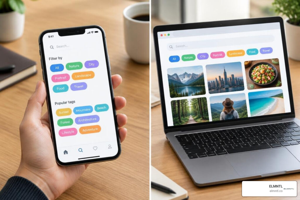
Tag UI Design Starts With What Each Label Does
Good tag ui design starts with a simple choice: is this label just information, or can someone act on it? Use a static badge for a status such as “In progress.” Use an interactive chip when people can select a category, filter results, or remove a choice. Make those actions clear with visible selected and focus states, readable text, and a clear way to undo a filter.
The shape can stay compact, but the behavior must be easy to understand. This guide covers the choices that matter most, from color and long labels to tag inputs, accessibility, and growing tag lists.
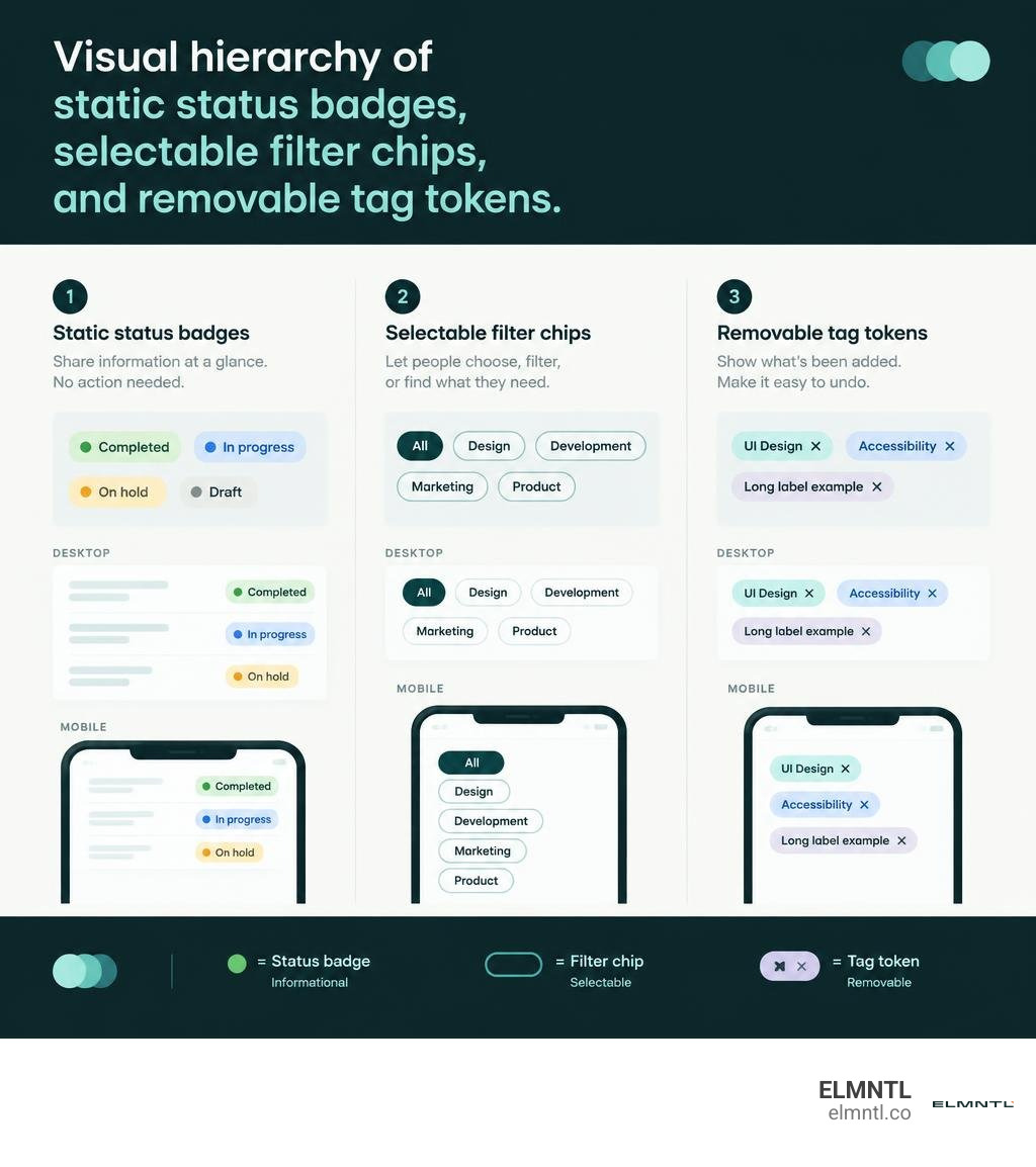
Tag ui design terms to know:
Badges, Pills, Chips, and Tags: Structural Differences in UI Design Systems
When building component libraries, teams often blur the lines between labels, badges, pills, and chips. The confusion usually stems from visual styling because all of these elements can share rounded corners and compact padding. However, mastering UI UX basics requires separating how an element looks from what it does.
| Component | Primary Function | Interactivity | Typical Affordances | Common Use Cases |
|---|---|---|---|---|
| Badge | Status or Count Display | Static (Non-interactive) | Solid/Muted background, text only, no icons | System status (“Active”), notification counts |
| Tag | Categorization & Metadata | Variable (Static or Linked) | Category label, optional hash or icon | Blog topics, metadata descriptors |
| Chip | Actionable Selection/Filtering | Interactive (Toggle/Selectable) | Checkmarks, selection rings, active tint | Multi-facet filters, search attributes |
| Pill | Visual Container Style | Context-dependent | Fully rounded pill border radius | Compact tags, standalone badges |
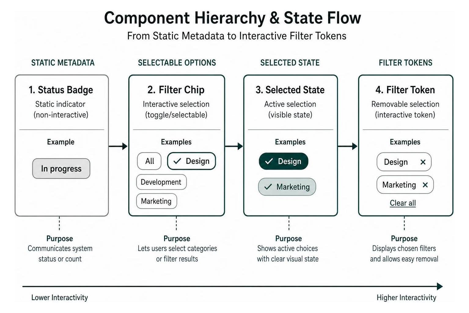
Component Taxonomy: Categorizing Badges vs Interactive Chips
To keep your design system clean, you only need two foundational functional families: static indicators and interactive controls. A badge communicates an authoritative, system-driven workflow state like “Approved” or “Pending Review.” It is non-clickable, does not change upon hover, and provides purely contextual information.
Interactive chips represent user-driven choices. Whether filtering a catalog, selecting audience segments, or attaching metadata tokens to a record, chips require interactive affordances. Exploring tag UI components in design systems shows that naming components explicitly based on their behavior, such as using “StatusBadge” versus “FilterChip”, prevents developers from accidentally attaching click handlers to static elements.
Anatomy and Behavioral States in Tag UI Design
An interactive tag component must support a robust set of visual states to guide users seamlessly through selection workflows.
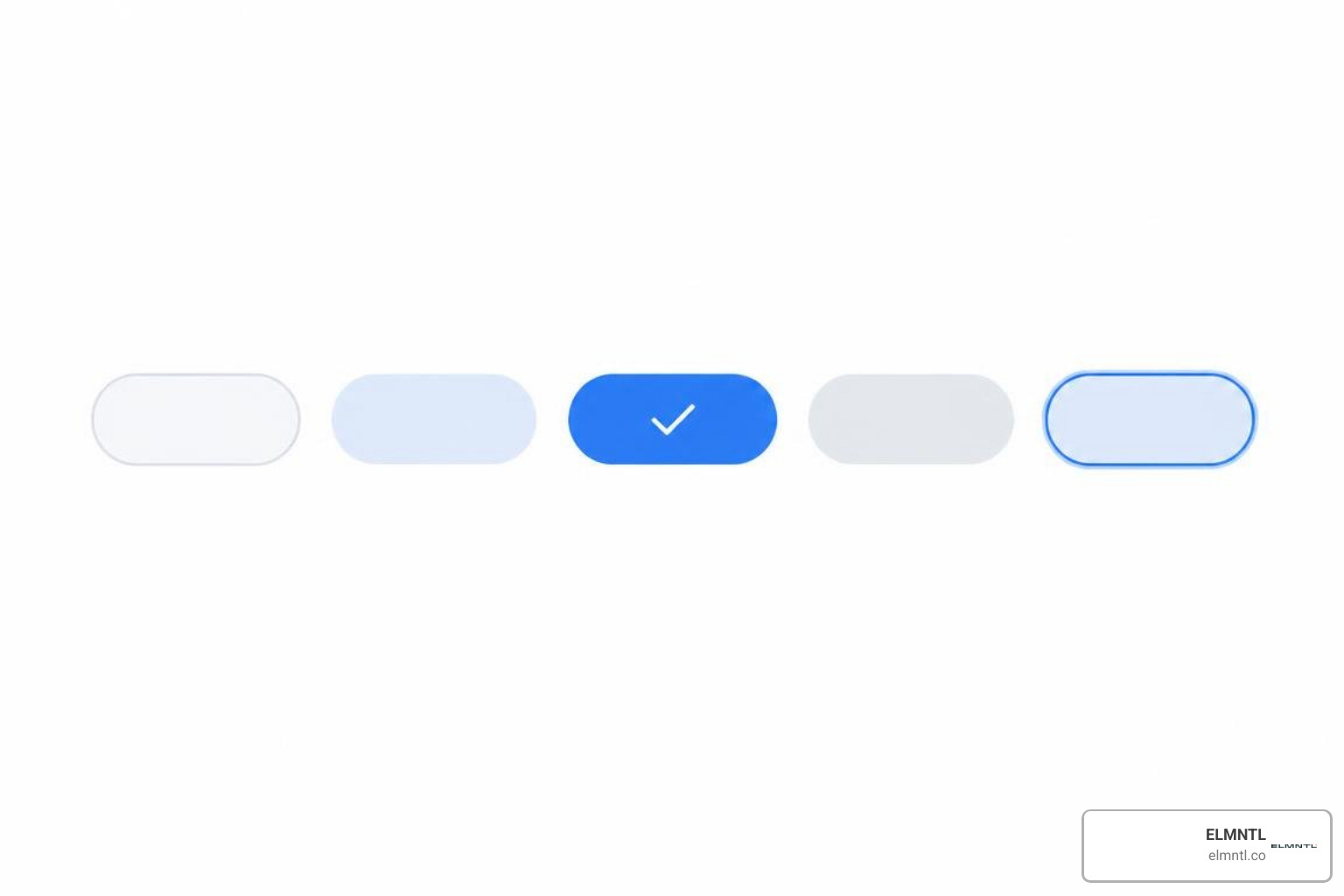
- Default: Subtle background with clear, high-contrast typography.
- Hover: Distinct background shift or border highlight to signal clickability.
- Selected: A filled background or visible checkmark indicating an active state.
- Disabled: Lowered opacity and a disabled cursor, indicating the attribute is unavailable.
- Removable: Contains a dedicated close icon button to detach the token from an active set.
- Focus-Visible: A 2px high-contrast focus ring surrounding the element for keyboard navigators.
Core Principles of Tag UI Design: Layout, Sizing, and Color Systems
Visual balance is critical when multiple tags appear together on data tables, product cards, or search headers. Grounding your layouts in UX design basics ensures that compact components remain readable and effortless to scan.
Dimensioning, Padding, and Touch Target Sizes
Tags should remain compact without sacrificing tap accuracy. Standard design system implementations, such as the Intergalactic Design System tag component, utilize standard sizing tiers: Medium (20px height) for dense tables, Large (28px height) for standard cards, and Extra Large (40px height) for touch-heavy filter panels.
On mobile screens, interactive tags must maintain an effective touch target of at least 48x48px to prevent accidental taps. While the visible tag chip might only be 28px tall, invisible padding or a minimum 8px margin between neighboring tags prevents mistaps. This layout buffer ensures compliance with pointer target minimums across modern devices.
Color Token Strategies and Contrast Ratios
Color in tag systems should reinforce recognition, not replace textual meaning. When applying dynamic colors, use a curated palette of 10 to 12 predefined tones rather than arbitrary RGB values.

To guarantee legibility, pair 500-tone palette tokens with dark text on light backgrounds or ensure at least 60Lc contrast under the Advanced Perceptual Contrast Algorithm (APCA). When auto-assigning colors based on tag names, use deterministic hashing algorithms so that a tag like “Marketing” always renders in the exact same hue across every view.
Truncation, Long Text Handling, and Layout Overflow
Uncontrolled tag lengths can quickly break dashboard cards and mobile screens. Avoid truncating labels that are under 24 characters. When a tag exceeds your layout width limit, truncate the text using an inline ellipsis and provide an accessible tooltip on hover and keyboard focus. In flexbox containers, allow tag lists to wrap naturally rather than cutting off horizontally, and provide a progressive disclosure button such as “+3 more” when space is constrained.
Input, Selection, and Filtering Patterns for Modern Interfaces
Tags shine brightest when users use them to refine data or assign attributes during content creation.
When reviewing modern dashboard UI inspiration, notice how top-performing interfaces separate selecting an existing tag from creating an entirely new one.
Single-Select vs Multi-Select Tag Input Workflows
In single-select workflows, clicking a tag toggles it on while unselecting any previous choice in that category. In multi-select scenarios, tags function as toggle groups.
For freeform tag inputs, follow the specifications outlined in the ClassroomIO tags UI format specification. As users type into a combobox input, display matching autocomplete results below. Pressing Enter or typing a comma converts the text into a removable tag token inside the input field. Ensure that backspacing on an empty input selects the preceding tag, and a second backspace removes it cleanly.
Facet Filtering, Active Constraint Bars, and Clear Mechanics
Complex data interfaces rely on faceted navigation where users combine multiple tags to narrow down results.
- Sticky Active Filter Bar: Keep active filter tags pinned above data tables so users always know which parameters are currently applied.
- Single-Click Removal: Each active filter chip must include an internal close icon allowing instant removal without opening a dropdown.
- Clear All Trigger: When two or more tags are active, display a dedicated “Clear all” button to reset the view in one step.
- URL Synchronization: Always reflect active tag selections in the browser query parameters so users can share, bookmark, and reload filtered views reliably.
Scaling Tag Systems and Taxonomy Governance
As collaborative applications grow, user-generated tags can rapidly devolve into synonym chaos without proper structure. Utilizing top UI development tools helps engineers build governed metadata systems that scale effortlessly.
Scaling Tag UI Design for Complex Taxonomies
To maintain strong scannability, aim for 5 to 7 tags per group. When categorizing hundreds of attributes, avoid flat tag clouds that overwhelm visual processing. Instead, organize tags into grouped facet blocks, such as Category, Role, and Priority. On mobile devices, move lengthy facet lists into collapsible bottom sheets with dedicated search inputs.
Controlled Creation, Merging, and Deletion Architecture
A scalable tagging system distinguishes between removing a tag from a single item and deleting it from the global taxonomy.
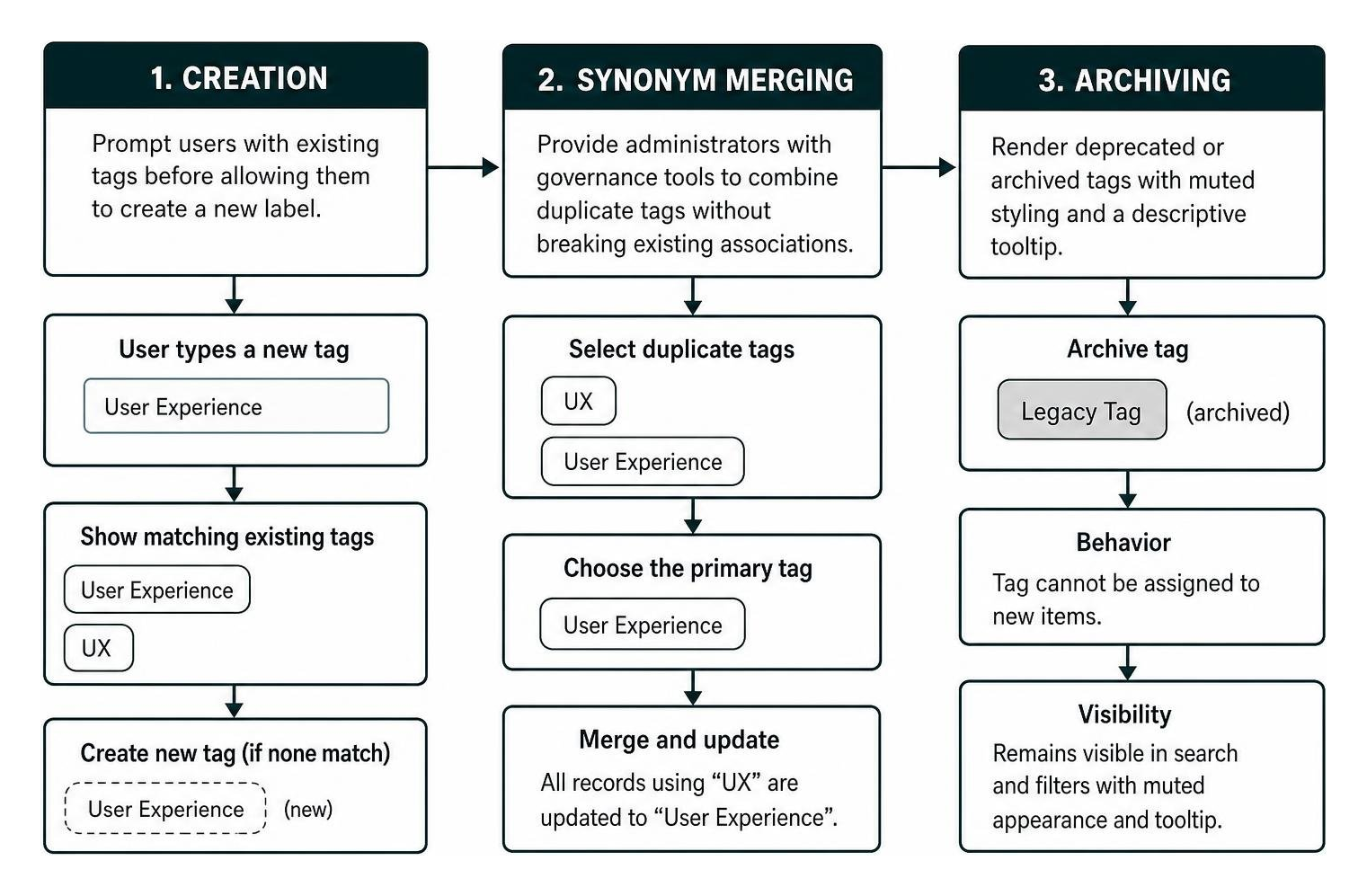
- Creation Guardrails: Prompt users with existing tags before allowing them to create a new label, reducing duplicate entries like “UX” and “User Experience.”
- Synonym Merging: Provide administrators with governance tools to combine duplicate tags without breaking existing record associations.
- Archive States: Render deprecated or archived tags with muted background styling and a descriptive tooltip, preventing new assignments while preserving historical data.
Frequently Asked Questions About Tag UI Design
How do you choose between a static badge and an interactive tag chip?
Choose a static badge when displaying an immutable status or count, such as “Published” or “3 items.” Choose an interactive chip when clicking the element performs an action, such as toggling a filter, opening a categorized search view, or removing an assigned attribute.
What is the optimal number of tags to display simultaneously without clutter?
Displaying 5 to 7 tags simultaneously is optimal for quick scannability. If an item contains more attributes, show the top three to five labels followed by a “+N more” badge that expands into a popover or drawer upon interaction.
How should tag components meet WCAG 2.2 touch target and contrast standards?
Interactive tags must meet minimum target dimensions of 24×24 CSS pixels on desktop and provide at least 48x48px of effective touch area with 8px spacing on mobile. Ensure text meets a 4.5:1 contrast ratio against the tag background, provide visible focus rings, and supply clear ARIA labels for dismiss buttons.
Conclusion
Building an intuitive tag system requires balancing compact styling with explicit behavioral cues. By distinguishing static badges from interactive chips, establishing accessible color palettes, and organizing complex taxonomies into structured facets, you create interfaces that make data exploration simple and engaging.
At ELMNTL, we help organizations design scalable design systems and high-performing web platforms. Explore our review of the best UI and UX software to equip your team with the tools needed to craft polished, accessible components.