

Foundational UX Design Recommendations and Core Principles
Effective UX design recommendations start with a few high-impact actions: simplify navigation so users can find what they need in seconds, streamline forms by reducing fields and using inline validation, meet WCAG accessibility standards for contrast and keyboard operability, and apply cognitive interaction laws such as Hick’s Law and Fitts’s Law to reduce decision time and make key actions easy to reach. These practical steps directly lower cognitive load, improve task completion, and support conversion rates before any visual polish is considered.
Designing high-performing digital interfaces requires more than visual flair. At its core, user-centered design is about aligning your interface with human cognition, expectations, and real-world behaviors. Understanding the complete guide to UI UX basics helps product teams distinguish between the emotional journey of a user and the physical interface components on a screen.
UX (User Experience) and UI (User Interface) design serve complementary, yet distinct, functions within product development. While UX focuses on problem-solving, structural architecture, and eliminating friction, UI handles typography, color palettes, visual hierarchy, and polished interactive states.
| Dimension | UX Design (User Experience) | UI Design (User Interface) |
|---|---|---|
| Primary Focus | User journeys, task completion, and behavioral flow | Visual touchpoints, aesthetic cohesion, and surface styling |
| Key Deliverables | Journey maps, wireframes, personas, and usability reports | Style guides, design tokens, high-fidelity mockups, and UI kits |
| Success Metrics | Task success rate, time-to-value, error rate, and SUS score | Brand alignment, visual consistency, and component scalability |
| Core Discipline | Cognitive psychology, interaction design, and information architecture | Graphic design, typography, color theory, and motion design |
When establishing interface standards, teams can draw from 195 research-backed design principles to systematically ground their layouts in empirical evidence rather than personal taste. Grounding your design in recognized usability standards, such as those cataloged in academic frameworks like XSL•FO, ensures your team accounts for critical interaction categories including feedback, navigation, flexibility, and error tolerance.
Cognitive Psychology and the Essential Laws of UX
Human interaction with software is governed by predictable psychological patterns. Understanding cognitive limits prevents users from feeling overwhelmed by unnecessary visual noise.
- Jakob’s Law: Users spend the vast majority of their time on other websites. They expect your site to function using familiar conventions, standardized layouts, and recognizable interaction patterns.
- Hick’s Law: The time required to make a decision increases logarithmically with the number and complexity of choices. Reducing primary actions on any given screen accelerates decision-making.
- Fitts’s Law: The time required to rapidly move to a target area is a function of the ratio between the distance to the target and the width of the target. Critical buttons must be sufficiently large and placed close to natural interaction zones.
- Miller’s Law: The average person can hold roughly 7 (plus or minus 2) items in their working memory at one time. Chunk complex information into bite-sized, digestible modules.
- Doherty Threshold: Productivity increases dramatically when computer and user interact at a pace under 400 milliseconds, ensuring users never feel delayed by system lag.
Examining the evolution of Don Norman UX and everyday design shows that intuitive affordances and visible signifiers remain the bedrock of positive user perception across all digital touchpoints.
Designing for Inclusive Accessibility and Universal Usability
Accessibility is not a secondary checklist; it is an essential component of quality engineering. A staggering 94% of top-grossing websites exhibit accessibility compliance issues across basic criteria such as keyboard navigation, image alt attributes, link labels, and form fields.
Following the Web Content Accessibility Guidelines (WCAG) ensures your experience is perceivable, operable, understandable, and robust for every individual. Adopting best practices from a web for everyone how to create inclusive user experiences ensures your team provides:
- Sufficient Contrast Ratios: Maintain a minimum contrast ratio of 4.5:1 for standard text and 3:1 for large text and critical UI elements against their backgrounds.
- Complete Keyboard Operability: Ensure every interactive control, dropdown, and modal can be accessed, navigated, and closed using only standard keyboard inputs.
- Screen Reader Compatibility: Provide descriptive labels, proper ARIA landmark roles, and structured heading hierarchies so assistive devices can accurately interpret the screen.
- Generous Touch Targets: Maintain interactive target sizes of at least 44 by 44 pixels for touch screens, with ample spacing between adjacent links.
The 5-Stage UX Design Process for Product Teams
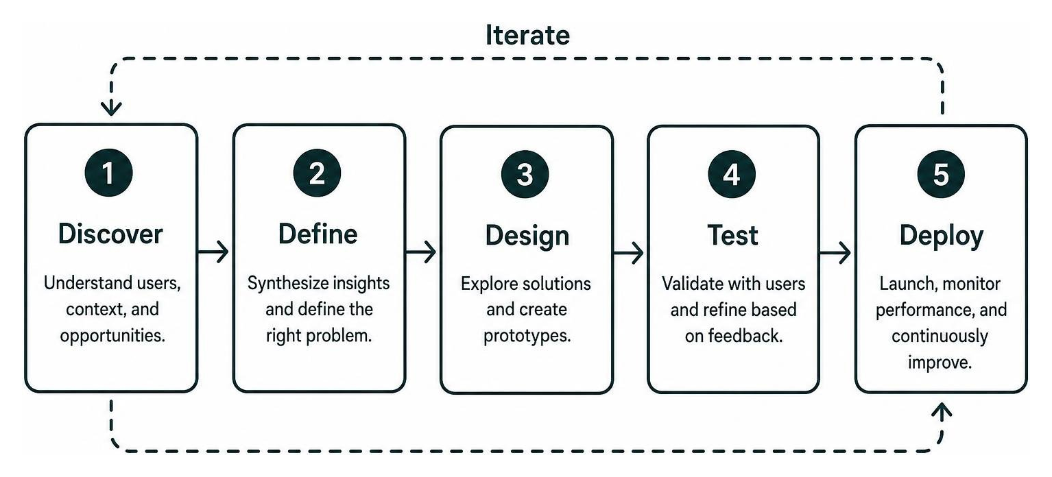
A structured design process prevents teams from building polished interfaces that solve the wrong problems. In demystifying the UX design process for modern teams, we break product development into five core phases: Define, Research, Prototype, Test, and Iterate.
As outlined in expert tips and recommendations for the UX design process, senior designers excel because they challenge assumptions early and focus relentlessly on the primary problem before jumping into visual software.
User Research and Journey Mapping to Uncover Real Friction
Continuous user research blends qualitative feedback with quantitative telemetry. Today, 40% of designers and 29% of developers actively use AI tools to analyze behavioral data and identify user friction points across complex journeys.
To map friction points accurately, teams should consult the complete guide to user journey mapping. Documenting touchpoints from initial awareness through onboarding and long-term retention highlights where users encounter cognitive roadblocks, rage-click unclickable elements, or abandon critical paths.
Prototyping, Usability Testing, and Continuous Iteration
Low-fidelity wireframes let you test structural hierarchy and information flow before investing heavy engineering resources. Once interactive prototypes are assembled, conduct usability testing with representative participants. Testing with as few as five users uncovers the majority of structural usability defects.
Conducting regular design audits, such as exploring how a website UI UX audit can save your conversion rate, provides actionable data to refine navigation paths, remove conversion bottlenecks, and elevate task success rates.
Interface Pattern Guidelines for High-Converting Digital Experiences
Standard design patterns provide intuitive shortcuts that reduce mental processing. The comprehensive design-pattern guidelines published by usability researchers highlight the value of standardizing input controls, dialogs, and navigation frameworks.
Mastering the science of seamless website navigation ensures users move through digital environments with minimal cognitive effort.
Streamlining Navigation, Search, and Product Filters
Navigation acts as the roadmap for your digital product. If users cannot locate what they need within seconds, engagement drops dramatically. Reviewing strategies to master UX design navigation before your users abandon ship helps teams build clean information architectures.
- Align Search with Query Intent: Research indicates that 61% of ecommerce search engines fail to match user query expectations. Support spelling variations, synonyms, product SKU numbers, and category terms with robust autocomplete suggestions.
- Provide Essential Filters: Only 43% of benchmarked ecommerce websites offer the top five key filter types users expect. Provide faceted filtering that updates lists instantly without full-page reloads.
- Maintain Clear Breadcrumbs: Implement hierarchical breadcrumb trails on desktop and mobile views to give users instant context and effortless upward navigation.
Form Optimization and Checkout Flow UX Design Recommendations
Forms represent the primary conversion bridge between user intent and business revenue. Yet, 18% of digital shoppers abandon orders purely due to overly complicated checkout processes.
According to extensive benchmark research on UX design principles, the average checkout flow contains 11.8 form fields, but most digital products can safely reduce this count by 20% to 60%.
To streamline forms and eliminate drop-off:
- Adopt a Single-Column Layout: Single-column forms create a clear downward path for the eye, preventing users from skipping inputs.
- Use Inline Real-Time Validation: Validate entries immediately upon field completion rather than after form submission. Clearly explain input formatting rules up front.
- Modernize Authentication: Implement passkeys, one-time passwords (OTPs), and social sign-ons to eliminate complex password creation hurdles.
- Autofill and Address Lookup: Integrate browser autofill and address verification APIs to minimize manual typing on mobile keyboards.
Personalization and Content UX Design Recommendations
Modern digital products rely heavily on algorithmically recommended content. Following established UX guidelines for recommended content ensures these suggestions assist users rather than feeling intrusive.
As specified in the technical recommendations UX pattern, product teams should apply specific interaction rules:
- Disclose Recommendation Sources: Label recommendation blocks with specific triggers, such as “Trending in your industry” or “Based on your recent purchase,” to establish algorithmic transparency.
- Provide Dismissal and Tuning Controls: Give users inline controls to hide irrelevant recommendations or mark them as “Not interested” with immediate UI updates.
- Separate Content Categories: Segment recommendations into distinct visual modules rather than mixing unrelated interests into a single feed.
- Implement Honest Cold-Start Fallbacks: When personal data is unavailable, present curated popular items instead of generating vague or misleading labels.
Mobile UX and Responsive Design Best Practices
With mobile devices generating more than half of global web traffic, mobile optimization directly impacts engagement and revenue. Usability studies from the User Experience for Mobile Applications report show that 63% of mobile users abandon a website or application during testing solely due to preventable mobile usability flaws.
Teams exploring how to improve website user experience 14 strategies that actually work should focus on essential mobile refinements:
- Design for One-Handed Thumb Zones: Place primary interaction triggers, navigation bars, and submit buttons in the lower two-thirds of the screen for effortless one-handed use.
- Eliminate Accidental Gestures: Provide clear confirmation or undo actions for destructive gesture-based interactions like swipe-to-delete.
- Optimize Dynamic Viewports: Account for expanding on-screen mobile keyboards so form fields and action buttons remain visible during input.
- Accelerate Initial Page Load: Implement progressive web application patterns, skeleton loading screens, and optimized assets to keep perceived load times well under two seconds.
Common UX Design Mistakes and Anti-Patterns to Avoid
Avoiding common pitfalls is just as important as implementing proven recommendations. Reviewing how to stop annoying your users essential website UX best practices helps teams spot and eliminate disruptive UI patterns:
- Deceptive Dark Patterns: Forcing pre-selected add-ons, hiding cancellation paths, or using misleading button phrasing destroys user trust and drives long-term customer churn.
- Premature Popups and Overlays: Prompting users for newsletter signups or app reviews before they have engaged with your core content creates immediate friction.
- Designing for the Designer: Prioritizing artistic visual trends over standard usability principles often leaves users confused and disoriented.
- Excessive Data Collection: Demanding unnecessary personal information during initial onboarding introduces security concerns and increases abandonment.
Frequently Asked Questions About UX Design Recommendations
What is the main difference between UX design and UI design?
UX design focuses on the user journey, problem-solving, structural architecture, and overall usability of a product, while UI design focuses on the visual presentation, interactive elements, typography, and aesthetic styling of the interface.
How many users are needed to uncover core usability issues during testing?
Conducting qualitative usability tests with five representative users typically uncovers up to 85% of core usability flaws and behavioral bottlenecks within a specific user flow.
How do UX design recommendations directly impact business conversion rates?
Applying research-backed UX recommendations reduces form friction, clarifies navigation paths, improves mobile accessibility, and lowers cognitive fatigue, directly increasing task completion rates and long-term customer retention.
Conclusion
Optimizing the user experience of your digital product is an ongoing, iterative process. By implementing proven UX design recommendations, grounding layout decisions in cognitive science, designing for inclusive accessibility, and removing friction from core conversion funnels, product teams create digital experiences that delight users and drive sustainable business growth.
Ready to elevate your digital product strategy and drive measurable results? You can explore creative strategy and design services with ELMNTL to craft intuitive, high-converting digital experiences tailored to your audience.