
What Makes the Best UI Design for an Android App?
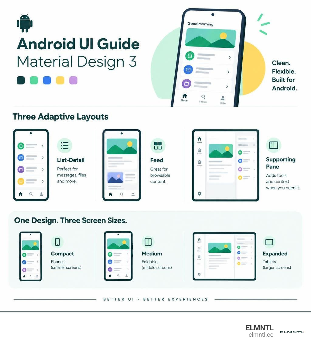
The best UI design for an Android app pairs clear navigation and readable content with layouts that adapt to the screen. Start with Material Design 3 components, then choose a layout that fits the task: list-detail for messages or files, a feed for browsable content, or a supporting pane for tools and context.
A strong design should also keep key actions easy to reach, text inputs visible above the keyboard, and content clear on phones, foldables, and tablets. The examples ahead show how to turn those principles into practical screens.
Simple best ui design for android app glossary:
Core Principles to Achieve the Best UI Design for Android App Projects
Building an outstanding Android application requires more than surface-level styling. It demands a deep understanding of foundational UI UX basics, disciplined visual craftsmanship, and adherence to established platform standards. Android serves billions of active users globally across diverse devices, aspect ratios, and regional configurations. Creating an intuitive experience starts with respecting the design conventions users already understand while establishing a clear, differentiated brand identity.
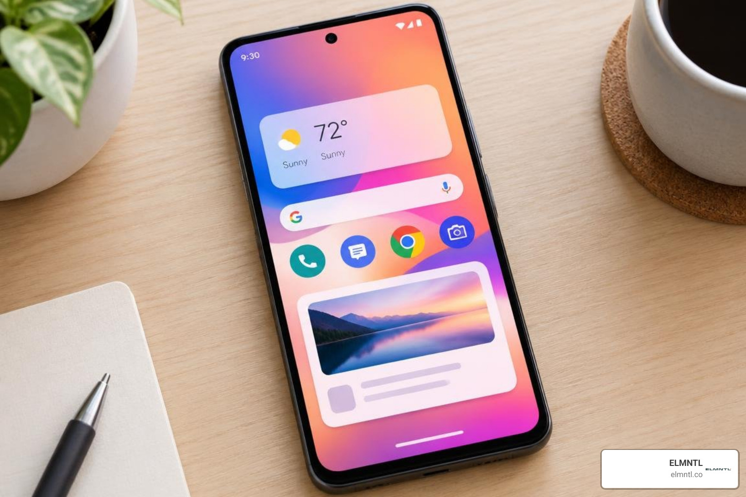
According to official Android Developers documentation, outstanding interfaces deliver immediate clarity, predictable navigation, and responsive touch feedback. When we construct an interface, visual hierarchy must guide the user journey effortlessly. High visual craftsmanship and thoughtful UX decisions directly influence user retention and help satisfy the quality criteria evaluated for store placement on Google Play.
Material Design 3 and Dynamic Color Theming
Material Design 3 represents the standard design system for modern Android experiences. It introduces dynamic color theming, where the system algorithmically extracts tonal palettes directly from a user’s chosen wallpaper or custom brand seeds. This creates a deeply personalized interface that integrates naturally with the system UI.
To apply dynamic theming successfully, designers use semantic color tokens rather than hardcoded hex values. The system handles light and dark themes automatically, maintaining proper contrast across surface containers, primary actions, and secondary text fields.
Key design elements within Material Design 3 include:
- Z-Axis Elevation and Depth: In modern Android architecture, visual elevation is defined using surface color shifts and subtle shadows. The Z-property governs both shadow spread and the drawing order of overlapping visual elements.
- Vector Drawables: Scalable, single-color vector assets ensure that UI iconography renders crisply across various device pixel densities without ballooning download file sizes.
- Palette API Color Extraction: Media and content-rich applications can dynamically sample key colors from artwork, album covers, or header photos to tint backdrop containers and interface accents.
Using official Android Developer UI Guidelines alongside tools like the Material Theme Builder in Figma enables design teams to validate color roles across both light and dark modes before handing assets over to developers.
Adaptive Layouts Across Window Size Classes
The modern Android ecosystem spans compact handheld phones, foldables, dual-screen devices, tablets, and desktop windowing environments. Designing for static physical screen dimensions is no longer viable. Instead, modern Android UI architecture relies on Window Size Classes to create responsive, scalable layouts.
Window size classes categorize display areas into three distinct width breakpoints: Compact, Medium, and Expanded.
| Window Size Class | Width Breakpoint (dp) | Typical Device Form Factors | Layout Architecture Strategy |
|---|---|---|---|
| Compact | Less than 600dp | Standard smartphones in portrait orientation | Single-column layouts, modal bottom sheets, bottom navigation bars |
| Medium | 600dp to 839dp | Small tablets, unfolded clamshell foldables, large phones in landscape | Multi-column grids, navigation rails, side sheets |
| Expanded | 840dp and wider | Large tablets, book-style foldables, desktop environments | Permanent navigation drawers, dual-pane canonical layouts, expanded supporting panes |
Designing with these breakpoints ensures your layout reorganizes its structure dynamically as users rotate their devices, resize app windows on tablets, or fold and unfold screens.
How Canonical Layouts Shape the Best UI Design for Android App Interfaces
Canonical layouts are proven, versatile architectural patterns that provide an optimal user experience across various form factors. Rather than inventing novel layout structures from scratch for every view, leveraging canonical patterns ensures standard navigation and predictable usability. Following a structured step-by-step Android app UI design process allows teams to map content into these patterns during the wireframing phase.
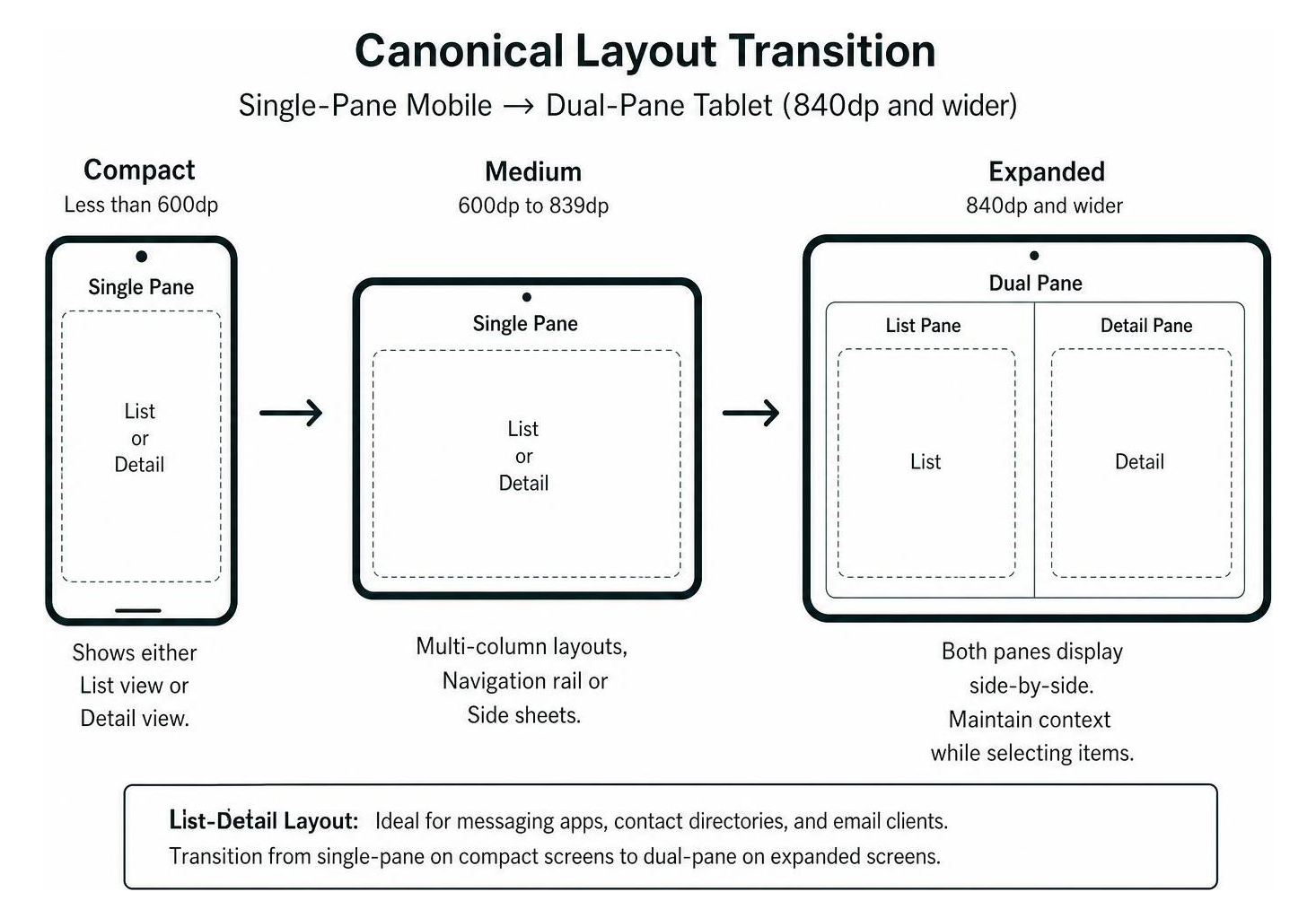
Official Canonical Layout Documentation details three core patterns:
- List-Detail Layout: Ideal for messaging apps, contact directories, and email clients. On compact screens, the interface shows either the list view or the detail view, switching between them hierarchically. On expanded screens (840dp and above), both panes display side-by-side, allowing users to select items without losing their context.
- Feed Layout: Perfect for social media feeds, e-commerce product catalogs, and photo galleries. This layout organizes tiles and cards into responsive grids. It transitions from a single vertical list on compact displays into multi-column Lazy grids using dynamic span allocations on wider surfaces.
- Supporting Pane Layout: Designed for productivity tools, document editors, and media players. Unlike a list-detail pattern where the secondary pane holds standalone content, a supporting pane contains contextual tools, comments, or metadata that only make sense alongside the primary canvas. On compact screens, supporting content rests inside a bottom sheet; on expanded displays, it expands into a dedicated 30% side pane.
Essential Components and Ergonomic Layout Patterns for Android
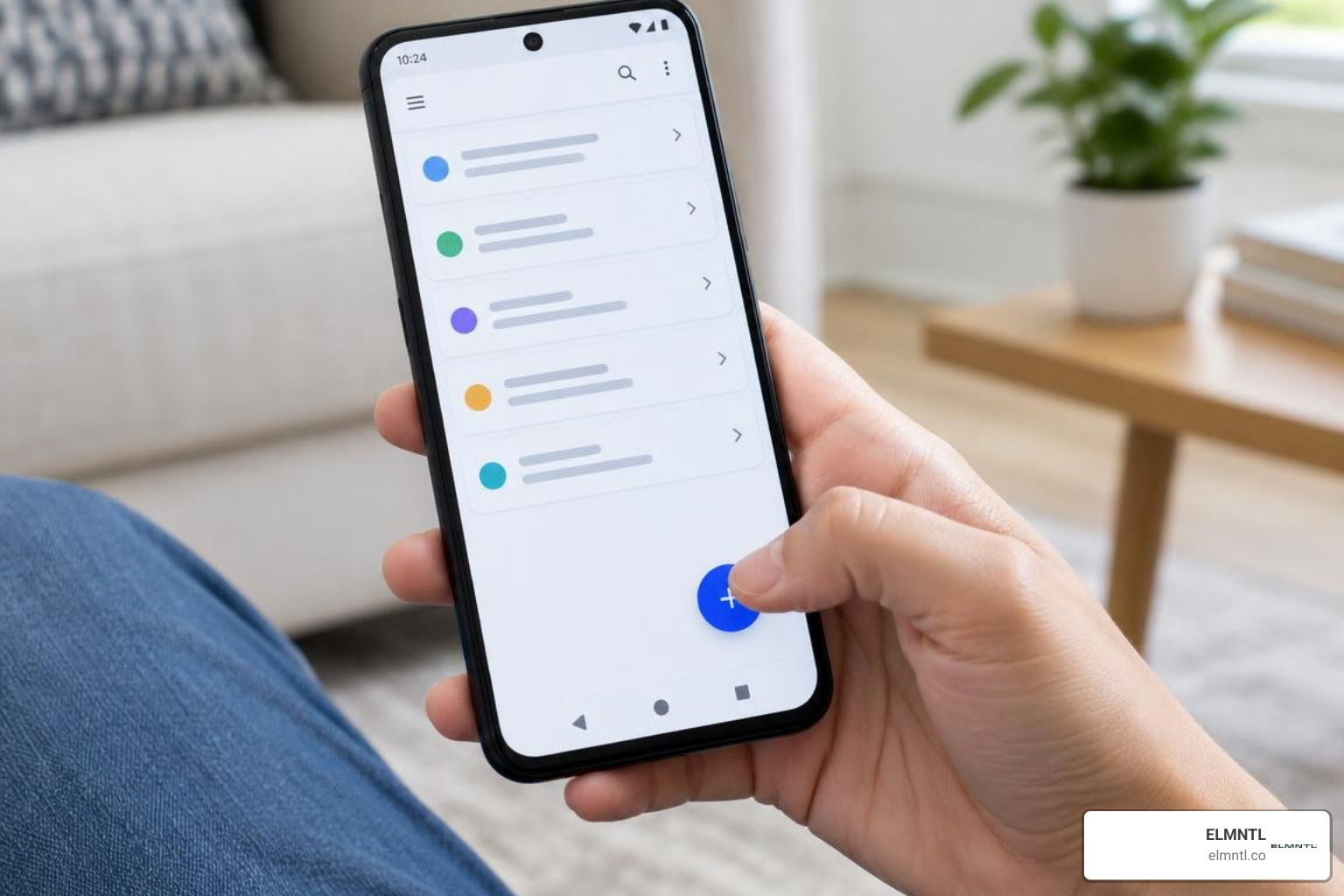
An effective mobile interface must respect physical ergonomics. Smartphone screens have grown larger, making top corners difficult to reach during one-handed use. Thoughtful component placement ensures primary interactions remain comfortably within the natural reach of a user’s thumb.
Primary Actions, Navigation, and Containment Groups
Android provides specialized UI building blocks designed to make navigation seamless and content consumption natural:
- Floating Action Buttons (FAB): Represents the single most important action on a screen, such as composing a message or creating a note. It floats above content in the lower ergonomic reach zone.
- Bottom Navigation Bars and Rails: Bottom bars provide primary top-level navigation on compact screens (3 to 5 destinations), while navigation rails serve medium and expanded screens along the left edge.
- Top App Bars: House the screen title, contextual navigation (such as back arrows), and secondary overflow actions.
- CardView Containment: Explicit containment groups related content, metadata, and associated interactive buttons together, guiding user attention across dense screens.
- Bottom Sheets: Surface contextual options, filters, or short user flows without navigating away from the current screen view.
Safe Areas, Keyboard Focus, and Input Visibility
Building edge-to-edge layouts creates an immersive experience by drawing UI elements behind system bars and display cutouts. However, edge-to-edge design requires strict handling of system insets and safe areas to prevent critical buttons from being obscured by hardware notches or gesture bars.
Similarly, software keyboard interactions must be handled carefully. When an input field gains focus, the layout must automatically adjust to position the input area above the keyboard. Text fields should never remain hidden beneath the keyboard frame. Modern Android builds also implement predictive back gestures, providing animated UI previews of the destination screen before a user completes their back swipe.
Practical Inspiration and Multi-Device Ecosystem Layouts
Studying real, production-ready interfaces is one of the most effective ways to discover creative patterns. While conceptual mockups are common online, examining shipped applications reveals how experienced teams solve edge cases, complex navigation, and localization challenges. Reviewing award-winning mobile app UI design examples helps demonstrate how top digital products balance aesthetic beauty with practical utility.
Top Inspiration Sources to Craft the Best UI Design for Android App Releases
To find practical benchmarks, designers turn to curated repositories and real-world reference libraries:
- Mobbin: A searchable library housing over 600,000 real-world production mobile screens and complete multi-step user flows, including onboarding, paywalls, and checkouts.
- Muzli: Used by over 900,000 designers worldwide, this discovery platform surfaces creative UI trends, motion concepts, and interface design examples.
- Dribbble: A vibrant visual showcase featuring downloadable UI kits and micro-animation ideas across fintech, e-commerce, and health apps on tags like mobile app UI designs and Android UI themes.
- Figma Community: Provides access to official Android Mobile App Design Templates, UI kits, and design system starters.
When rapidly testing interactive concepts, prototyping with mobile app UI tools ensures that micro-interactions, layout transitions, and touch responses feel fluid before development begins.
Extending UI Reach to Wearables, TV, and Automotive Surfaces
Modern Android interfaces extend far beyond smartphones. Building a complete application ecosystem requires designing for various contextual surfaces:
- Home Screen Widgets: Compact, glanceable UI components that display dynamic content directly on the user’s home screen, built using canonical widget templates for quick engagement.
- Wear OS: Smartwatch interfaces demand lightweight, high-frequency, at-a-glance information cards and tiles designed for circular displays and rapid wrist interactions.
- Android TV: Designed for 10-foot viewing experiences, television UIs require strong visual focus states, horizontal card carousels, and directional D-pad navigation.
- Android Auto and Android Automotive OS: In-vehicle screens require simplified, glanceable typography, large touch targets, and strict safety ergonomics to minimize driver distraction.
Accessibility, Localization, and Deep Link Architecture
Approximately 15% of the world’s population relies on accessibility support to communicate, learn, and navigate digital interfaces. Building accessible Android apps is essential for delivering an inclusive user experience:
- Touch Targets: Ensure all interactive elements measure at least 48x48dp with sufficient padding to prevent accidental misclicks.
- Color Contrast: Maintain strong contrast ratios between foreground text and surface backgrounds, satisfying standard accessibility guidelines.
- Content Descriptions: Provide accurate text labels on vector drawables and image buttons for screen readers like TalkBack.
- Localization: Design flexible UI containers that accommodate expanding text strings across different languages, currencies, and right-to-left layout orientations.
- Deep Links and Credential Restore: Implement verified deep links that resolve instantly to exact in-app content, and integrate credential restore APIs so returning users stay signed in across device upgrades.
Frequently Asked Questions About Android App UI Design
What is the recommended layout pattern for responsive Android screens?
The recommended layout approach utilizes Android’s canonical layouts: list-detail, feed, and supporting pane. These architectural patterns adapt dynamically across Compact (<600dp), Medium (600dp to 839dp), and Expanded (>=840dp) window size classes, ensuring seamless scaling across phones, foldables, and tablets.
How does Material Design 3 handle dynamic color across devices?
Material Design 3 generates an algorithmic tonal palette derived from the user’s custom wallpaper or designated brand color seeds. It maps these tones into standardized semantic color tokens for surfaces, containers, and actions, automatically maintaining accessibility and contrast across light and dark modes.
What are the key breakpoints for Android window size classes?
Android categorizes window size classes using three primary width breakpoints: Compact for widths below 600dp (standard portrait phones), Medium for widths between 600dp and 839dp (foldables and small tablets), and Expanded for widths of 840dp and greater (large tablets and desktop layouts).
Conclusion
Achieving exceptional UI design on Android requires a balance of visual creativity, platform conventions, and responsive technical architecture. By embracing Material Design 3 guidelines, building with canonical layouts across window size classes, and designing for accessibility, teams can create apps that deliver intuitive user experiences on every form factor.
Whether you are launching a new consumer product or expanding an existing mobile ecosystem across foldables, wearables, and large screens, having the right design workflows in place makes all the difference. Explore our expert UI and UX software toolkit to evaluate the industry’s top tools and build polished, production-ready interfaces faster.